How to create memorable Brand Identity : A Simple Guide

Riddhima K.
Content Writer at Socialwyz | 14 min read
Share on:
Dec 20, 2022

Do you intend to develop a recognisable corporate identity for your company in 2023? If so, you are not by yourself. One of the most crucial facets of marketing is branding because it allows you to differentiate yourself from the competition and draw in devoted clients. A recent research found that a consistent brand presentation could boost sales by up to 33%. But branding is more than just coming up with a catchy catchphrase or logo. It involves developing a distinctive and genuine image that represents your values, personality, and vision:
What is the role of brand identity design in business marketing ?
What are the Elements of Brand Identity Design ?
How to build a Brand Identity ( 11 step process) ?
How to create a brand style guide ?
What are some tips for avoiding common errors while developing a brand identity design?
Discover successful video storytelling case studies across 20 diverse domains including AI, Blockchain, Cybersecurity, E-commerce, Gaming, Robotics, Healthtech and Spacetech. These case studies showcase effective strategies and tactics employed in their campaigns, delivering quantifiable results in their respective industries.
If you’re seeking to create a kick-ass brand identity, look no further than this guide. We’ll share tips and tricks to help you create a brand identity that resonates with your audience and sets you apart from the competition.
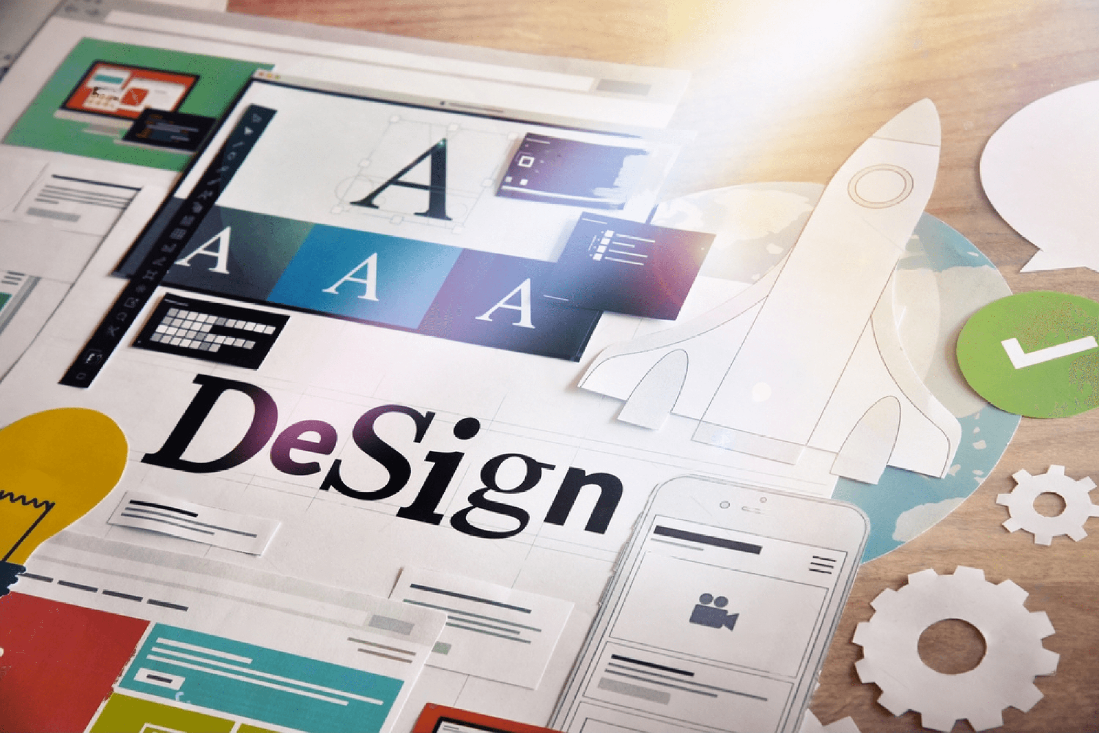
I. What is brand identity design ?
Brand identity design is not just about creating a logo or a website. It involves developing a unified and cohesive system of written and graphic components that convey the character and principles of your brand. “A brand is not just a logo, website, or your business cards — it’s an experience”, claims Dribble. Designing a brand’s personality is therefore about influencing that experience for your target market.

a. What is the role of brand identity design in business marketing ?
The creation of a brand’s identity is an important marketing strategy because it a ffects how current and potential customers view and anticipate goods and might influence their actions and judgements :
A brand identity that conveys dependability, professionalism, and quality, for instance, might attract more customers who are looking for these attributes in a product or service.
Customers who are looking for something new and thrilling will be attracted to a brand identity design that embodies originality, invention, and fun.
b. What are the possible disadvantages that a business might face in the absence of a proper brand identity design?
Not having a brand identity design can result in lost opportunities and revenue for a business. Here are some potential losses a business may face:
Lack of recognizability: Without a dependable and recognisable brand identity, it can be challenging for consumers to tell one company from another. Potential customers may decide to use a more well-known name as a result, which could result in a loss of business.
Loss of credibility: A brand identity that is inconsistent or poorly designed can give the impression that a company is unprofessional, unreliable, and not deserving of investment. Losses in chances and money may result from this.
Inability to stand out: A company that lacks distinctive branding may struggle to separate out from the competition and attract customers. Sales may be lost as a result, and chances to stand out from the competition may also be lost.
Decrease in customer loyalty: Customers may find it difficult to form an emotional bond with the company in the absence of a powerful and consistent brand identity. This lessens their devotion, which may result in lost business and trouble keeping hold of current clients.
Overall, a weak brand identity design can result in lost opportunities, diminished brand equity, and lost income.
II. What are the Elements of Brand Identity Design ?
Brand identity design is the process of creating a distinctive and memorable visual representation of a brand. It includes the design of various elements that communicate the brand’s values, personality, and message to the target audience. Some of the key elements of brand identity design are:
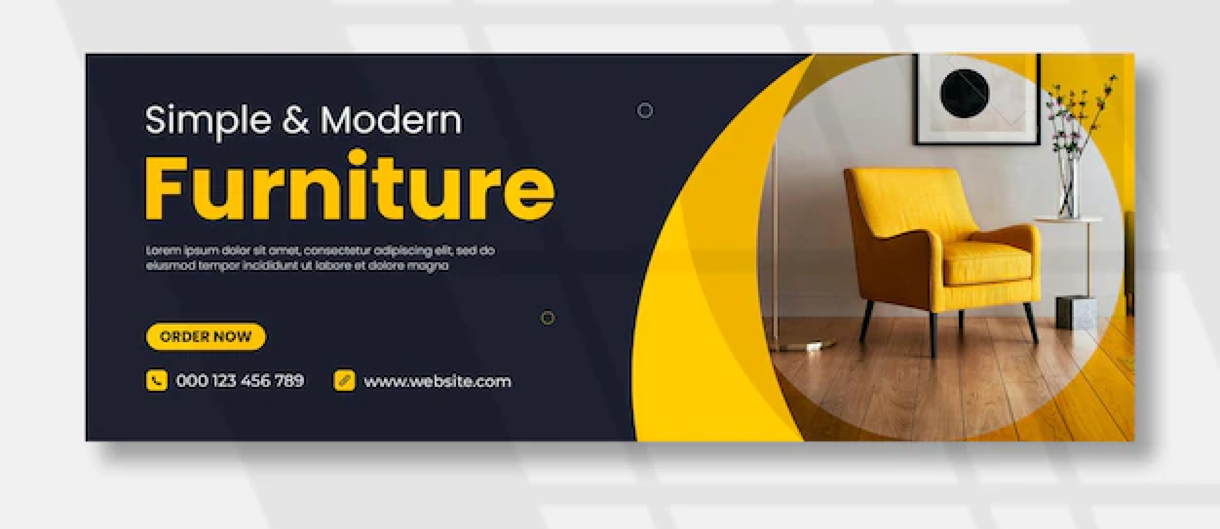
Logo Design: A logo is a graphic symbol or wordmark that identifies and represents a brand. It is often the first impression that a potential customer has of a brand, and it should convey the brand’s essence, mission, and differentiation. A logo should be simple, memorable, versatile, appropriate, and timeless.
Color Palette: A color palette is a set of colors that are used consistently across all the brand’s visual materials. Colors have different meanings and associations in different cultures and contexts, and they can evoke various emotions and moods. A color palette should reflect the brand’s personality, values, and message, and create a strong visual identity.
Typography: Typography is the art and technique of arranging type to make written language legible, readable, and appealing. It includes the choice of fonts, sizes, styles, spacing, alignment, and hierarchy. Typography can enhance the brand’s message, tone of voice, and visual identity, and create a sense of harmony and coherence.
Visual Imagery: It refers to the use of pictures, drawings, icons, graphics, animations, videos, or any other visual elements to convey a brand’s narrative, message, and value proposition. Visual imagery has the power to draw viewers in, arouse feelings, forge connections, and support corporate identity.
Tone of Voice: The way a company communicates its personality and attitude in both written and spoken language is known as its “tone of voice.” It covers word choice, phrase choice, syntax, punctuation, and style. The audience’s perception of and feelings towards a company can be influenced by the speaker’s tone of voice. The tone of voice should be consistent, true to the brand, and suitable for the context and target market.
Brand Messaging: Brand messaging is the central message that conveys to the target market the goals, value proposition, points of distinction, and advantages of the brand. The company name, tagline, goal statement, vision statement, values statement, elevator pitch, and any additional key messages are all included in this section. All of the brand’s touchpoints should use uniform, compelling, clear, and concise messaging.
Brand Storytelling: Using stories to engage the audience’s feelings and minds while promoting a specific business is the art and science of brand storytelling. It entails creating a brand narrative that details the company’s background, goals, principles, struggles, and triumphs. By telling a compelling story about your business, you can encourage consumer loyalty, advocacy, and trust.
These are some of the essential elements of brand identity design that can help a brand stand out from the competition and create a lasting impression on the audience.
III. How to build a Brand Identity ( 11 step process) ?
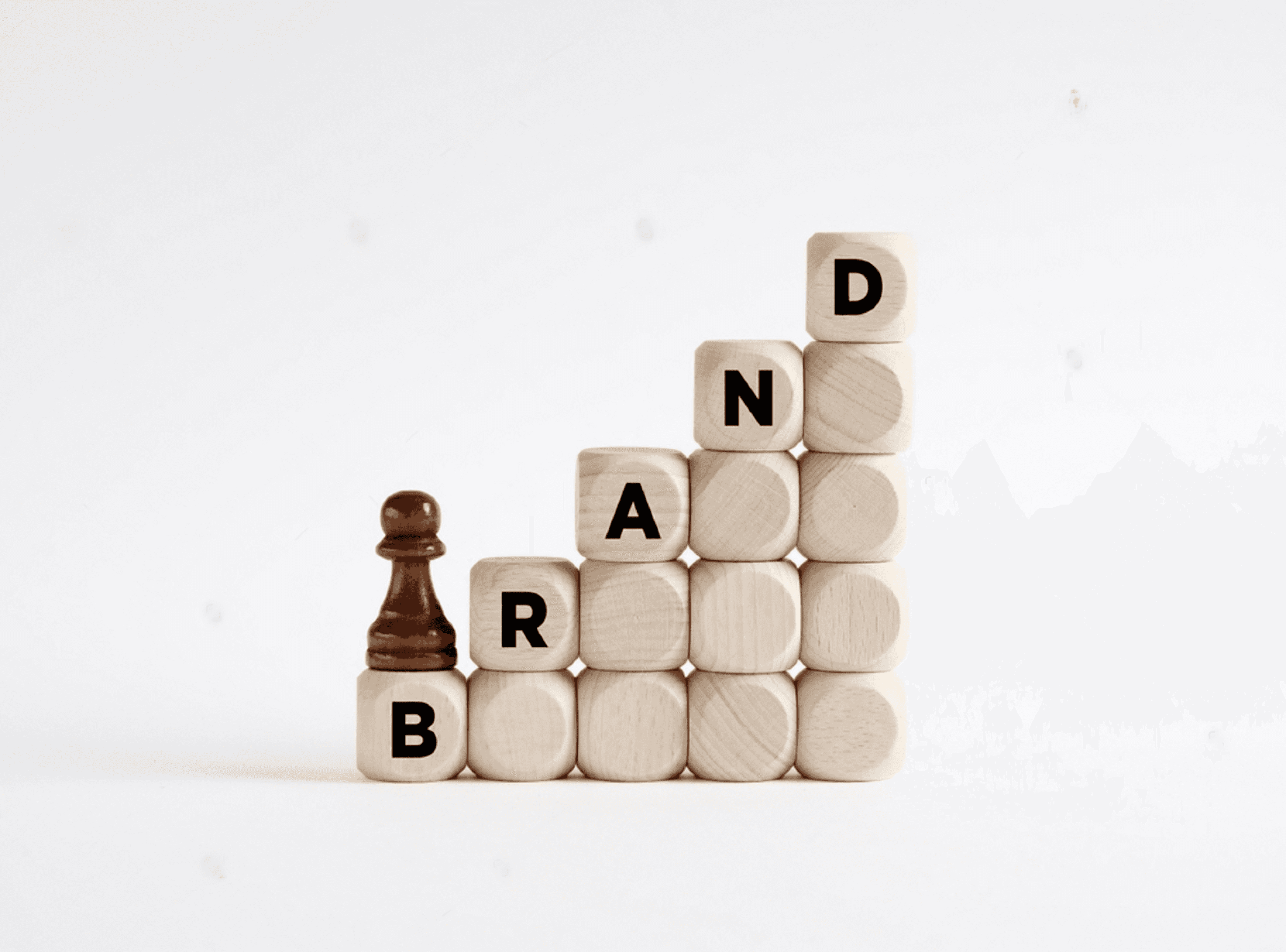
It’s difficult to develop a brand identity that people will remember. It requires a great deal of imagination, investigation, and effective planning. There is more to a company identity than just a name or a logo. It is the culmination of all your vocal and visual cues for who you are, what you do, and how you do it. All touchpoints and channels should have a consistent, coherent, and recognisable corporate identity.
Step 1 : Identifying Brand Values
Brand values are the principles that direct how an organisation conducts its operations. Your brand’s character, perception, and reputation are shaped by these guiding concepts. Additionally, they assist you in enticing and keeping partners, clients, and workers who share your goals.
However, how do you determine your brand’s values? How can you ensure that they are genuine, constant, and applicable? The steps listed below will help you successfully define and communicate your fundamental brand values :
1. Define the Purpose of Your Brand
The first step is to clarify why your brand exists and what it stands for.
What is the goal of your brand?
What issue are you addressing for your clients?
What kind of world influence are you hoping to make?
Your brand’s mission statement needs to be compelling, straightforward, and concise. Both your audience and your staff should be moved by it.
You can use resources like Marty Neumeier’s Brand Purpose Statement template or Simon Sinek’s Golden Circle model to describe your brand purpose. You can also consider companies with a clear sense of mission, like Patagonia, Airbnb, or TOMS.

2. Determine Your Target Audience
The next step is to identify who your brand is for and who it is not for.
Who are your ideal customers?
Who are your perfect clients?
What are their wants, requirements, obstacles, and aspirations?
What impressions do they have of your company’s name and those of your rivals?
What emotions do you want them to experience when they engage with your brand?
You can use tools like buyer personas, customer journey maps, or surveys to figure out who your target market is. To comprehend the behavior, preferences, and comments of your audience, you can also look at data from your website, social media platforms, or CRM platforms.
3. Analyze Competitors
The third step entails comparing your brand to other ones in your business or niche.
Who are your primary and secondary rivals?
What are their assets and liabilities?
What are their company’s core principles?
How do they convey them?
What sets you apart from the competition?
SWOT analysis, a competitive matrix, or a perceptual map are a few instruments you can use to research your rivals. Additionally, you can check out their websites, social media accounts, or evaluations to see how they present themselves and what their clients think of them.
Step 2: How to develop a Brand Identity Design Brief
A brand identity design brief is a document that summarizes the goals, objectives, target audience, tone, and visual style of a brand. It serves as a guide for the designers who will create the brand identity elements, such as the logo, color palette, typography, imagery, and more. A well-written brief can help ensure that the brand identity is consistent, coherent, and aligned with the brand’s vision and values.
A brand identity design brief typically includes the following sections:
Background: This section provides some context and history about the brand, its mission, vision, values, and unique selling proposition. It also describes the current situation and challenges that the brand faces, and the opportunities and goals that it wants to achieve.
Target Audience: This section defines the ideal customers or clients of the brand, their demographics, psychographics, behaviors, needs, pain points, and aspirations. It also identifies the competitors and differentiators of the brand in the market.
Tone: This section specifies the personality and voice of the brand, how it wants to communicate with its audience, and what emotions it wants to evoke. It may include some adjectives or keywords that describe the tone, such as professional, friendly, playful, authoritative, etc.
Visual Style: This section outlines the desired look and feel of the brand identity, its mood and atmosphere. It may include some examples of existing brands or designs that inspire or resonate with the brand. It may also include some preferences or guidelines for the logo, color palette, typography, imagery, icons, etc.
Deliverables: This section lists the specific items or assets that need to be designed for the brand identity project, such as the logo variations, stationery, website, social media graphics, packaging, etc. It may also indicate the timeline and budget for the project.
A brand identity design brief is a crucial tool for any branding project. It helps to clarify the expectations and requirements of both the client and the designer. It also helps to avoid misunderstandings and revisions later on. By developing a comprehensive and detailed brief, you can ensure that your brand identity design will be effective and successful.
Step 3: How to choose a brand name and tagline ?
A brand name and a tagline are the two most important elements of a successful branding plan. They aid in the communication of your value offering, assist in differentiating you from the competition, and leave a long-lasting impression on your target audience. But how do you come up with an intriguing and memorable business name and tagline?
We’ll examine the different standards and categories for brand names and taglines as outlined by Marty Neumeier, a renowned brand strategist and author of The Brand Gap and Zag. According to Neumeier, the development of brand identities and taglines is guided by the following four major principles:
Distinctiveness: Your name and tagline should stick out from the competition to prevent brand misunderstanding. Additionally, they ought to showcase your distinct style and personality.
Relevance: Your brand’s name and slogan should resonate with your target audience and communicate your main advantage or promise. Additionally, they ought to complement your brand’s image and strategy.
Memorability: Your company name and tagline ought to be simple to recollect. Additionally, they ought to be distinctive, inventive, and catchy.
Extendability: Your tagline and name should be adaptable enough to allow for future development. They should also be flexible enough to work in various settings and media.
What are the categories of brand names and taglines?
Neumeier suggests that there are six main categories of brand names and taglines, each with its own advantages and disadvantages:
Descriptive: These are names and taglines that describe what the brand does or offers. For example, American Airlines, Netflix, Just Do It. The advantage of this category is that it is clear and informative. The disadvantage is that it can be generic and boring.
Evocative: These are names and taglines that evoke an emotion or an image related to the brand. For example, Apple, Virgin, Think Different. The advantage of this category is that it is memorable and distinctive. The disadvantage is that it can be vague and abstract.
Invented: These are names and taglines that are made up or coined by the brand. For example, Google, Kodak, Impossible is Nothing. The advantage of this category is that it is unique and original. The disadvantage is that it can be hard to pronounce or spell.
Experiential: These are names and taglines that relate to the experience or benefit of using the brand. For example, Airbnb, Spotify, The Happiest Place on Earth. The advantage of this category is that it is relevant and engaging. The disadvantage is that it can be limiting or misleading.
Metaphorical: These are names and taglines that use a metaphor or a symbol to represent the brand. For example, Amazon, Nike, The Ultimate Driving Machine. The advantage of this category is that it is creative and powerful. The disadvantage is that it can be obscure or confusing.
Acronymic: These are names and taglines that use initials or abbreviations of words or phrases. For example, IBM, KFC, BMW. The advantage of this category is that it is concise and easy to remember. The disadvantage is that it can be bland or meaningless.
In conclusion, the name that resonates with your customers and accurately represents your brand personality is the best choice for your brand name or tagline. When selecting a brand name, you should also take into account trademarks, social media handles, and domain name availability.
Step 4: How to design a logo for your brand ?
Your brand’s identity, beliefs, and personality are visually represented by your logo. It aids in differentiating you from the opposition and leaving a positive impact on your clients. How, however, do you create an emblem that accurately conveys your message and fits your brand? We’ll discuss the various kinds of logos, along with the best methods for making them

a. Types of Logos
There are several different styles of logos, each with its own set of advantages and disadvantages. Here are some of the most common types of logos:
There are several different styles of logos, each with its own set of advantages and disadvantages. Here are some of the most common types of logos:
(1) Wordmark Logo: These are wholly text-based logos. For companies with titles that are simple to say, this kind of logo works well. (e.g., Google, Coca-Cola, FedEx).
Pros : They are successful when the company name is the most recognisable aspect of the brand because they are straightforward and easy to read.
Cons: They might be hard to distinguish from other logos that mimic them, and they might perform worse in smaller sizes.
(2) Lettermark Logo: A lettermark logo is like a wordmark, but it only consists of the company’s name’s letters. (e.g., IBM, NASA, HBO).
Pros : They are simple to read and can be a great way to shorten a lengthy or complex business name, similar to wordmarks.
Cons: They might not be as recognisable or memorable as other logo kinds.
(3) Iconic/Symbolic Logo: An iconic logo is a graphic depiction of a company’s character that frequently makes use of symbols or other visual elements. (e.g., Apple, Nike, Twitter).
Pros: They stand out, are distinctive, and are simple to identify.
Cons: They might not be as intuitive as other logo types and might need some background or explanation to make sense.
(4) Combination Mark Logo: A combination mark is a logo that uses both text and symbols or images. (e.g., Burger King, Mastercard, Amazon).
Pros: They offer the best of both worlds, with text and symbols working together to create a unique and memorable image.
Cons: They may be more complicated and difficult to reproduce than other types of logos.
(5) Emblem Logo: An emblem logo is a design in which the business name is encased within a symbol or emblem. (e.g., Starbucks, Harley-Davidson, BMW).
Pros: They can be very recognisable and are frequently connected to a classic or conventional feel.
Cons: They might not function well in all situations and can be challenging to reproduce in tiny sizes.
(6) Abstract Logo: An abstract logo is one that employs an abstract form or pattern to represent the business. (e.g., Adidas, Pepsi, Airbnb).
Pros: They can be very distinctive and memorable, and they encourage a lot of ingenuity.
Cons: Compared to other types of logos, they may not be as effective at conveying the brand’s identity and may require more context or explanation to understand.
Each of these styles of logos can have benefits and drawbacks depending on the needs of the company. It is important to consider the company’s goals and values when deciding which type of logo to use.
b. Best practices for designing a logo
Making a logo is not a simple job. It necessitates extensive investigation, innovation, and experimenting.Here are some guidelines to abide by when creating an emblem for your company:-
The audience you want to attract: Prior to creating your logo, you should ascertain who your target market is and what they anticipate from your company. You can use this to choose the best font, color, and design for your logo.
The competitors you want to differentiate from: Examine their logos to see what works and what doesn’t for them. By doing this, you can avoid imitating them and set yourself apart from them.
The message you want to convey: You must be certain of the message you want your emblem to convey. What is your brand’s fundamental value proposition? What characteristics characterise your brand? What is the spirit behind your company? You can define the essence of your logo with the aid of these queries.
The values you want to express (Type of Logo): You need to select the type of logo that best represents your business based on your target audience, competitors, and message. Would you rather highlight your identity or your appearance? How precise or abstract do you want to be? Do you prefer simplicity or complexity? You can reduce your options by asking yourself these inquiries.
The emotions you want to evoke (Color): One of a logo’s most critical components is colour. It has the ability to arouse feelings, communicate meanings, and forge associations. You must select a colour that embodies your company identity and appeals to your target market. To comprehend how various colours affect people’s perceptions and behaviors, you can use colour psychology as a reference.
The personality you want to show (Font): Another essential component of an emblem is the font. It can convey the tone, personality, and style of your business. You must select a font that goes with the style of your logo and goes well with your colour palette. Understanding the characteristics and impacts of various fonts on readers’ perceptions and reactions can be done using typography principles as a guidance.
Test your logo: After creating your logo, you must try it across a range of media and platforms. Your emblem must be scalable, adaptable, and readable in a variety of forms, shapes, and backgrounds. To find out if your stakeholders and potential customers like and comprehend it, you should also solicit their feedback.
A logo is more than just a graphic element. It is a powerful tool that can help you build a strong brand identity and connect with your audience. By following these steps and best practices, you can design a logo that represents your brand in the best possible way.
Step 5 : How do I choose a color palette for my brand?
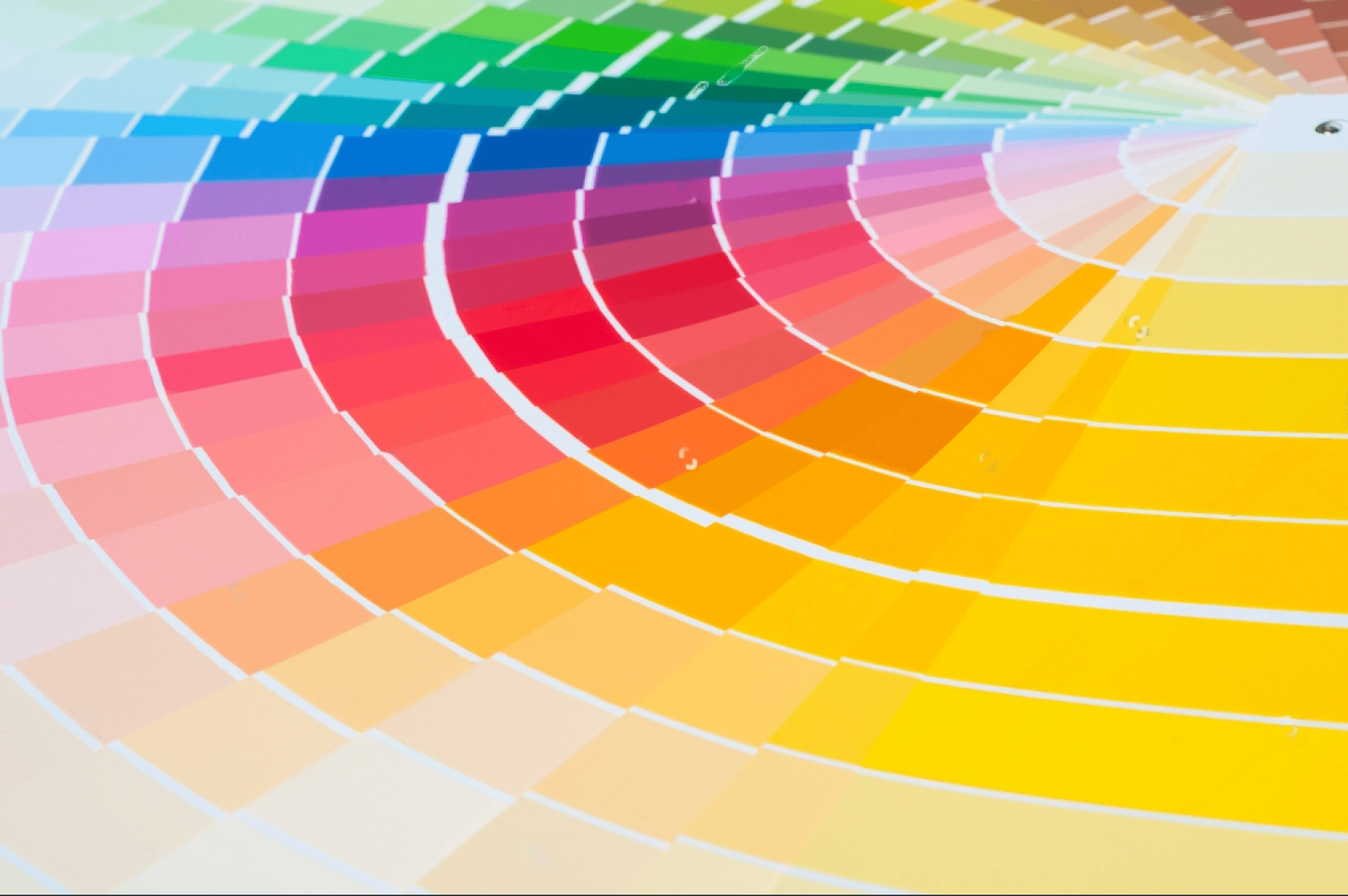
Whether you’re designing a website, a logo, an ad, or anything else, picking a colour scheme is a crucial first step. A colour scheme can help you communicate a mood or message, attract attention, and produce a unified and consistent appearance. How, then, do you pick a colour scheme that suits your project? To assist you, consider the following advice and best practises.
a. Different types of colour palettes
Depending on the effect you want to accomplish, you can use a variety of colour palettes in your design project. Here are a few prevalent ones:
Monochromatic: This type of colour scheme only employs one hue (or colour), with variations in its brightness and saturation. For instance, azure, sky blue, turquoise, and other shades of blue can be used in a monochromatic palette. A monochromatic palette can produce a simple and elegant appearance, but if used carelessly, it can also be dull or boring.
Analogous: This style of colour scheme makes use of hues that are close to one another on the colour spectrum. Green, blue-green, and yellow-green, for instance, can all be found in an analogous colour scheme for the colour green. An analogous colour scheme can give off a harmonious and organic appearance, but if the hues are too similar, it may also lack contrast or interest.
Complementary: This colour scheme pairs hues that are directly across from one another on the colour spectrum. For instance, lavender and yellow can be used as complementary colours. A complementary colour scheme can produce a lively and vibrant appearance, but if the hues are not balanced, it can also be too loud or clash.
Triadic: This colour scheme makes use of shades that are evenly spread out across the colour wheel. An orange triadic scheme, for instance, might contain orange, green, and purple. If the colours are not coordinated, a triadic palette can be too complicated or perplexing as well as balanced and lively.
b. Understanding colour psychology
Colors have specific psychological effects on human emotions, behavior, and perception. Here’s a brief summary of the psychology behind different colors:
(1) Red: Associated with passion, love, and energy but can also evoke feelings of anger and danger.
Suitable for Industry: Consider fast food outlets like McDonald’s and KFC, entertainment options like Netflix, and the auto industry. (think Ferrari and Lamborghini).
(2) Orange: Associated with playfulness, enthusiasm, and warmth.
Suitable for Industry: This covers the leisure sector (see Nickelodeon and Fanta), the culinary sector (consider Dunkin’ Donuts and Taco Bell), and the outdoor sector. (think The North Face and REI).
(3) Yellow: Associated with joy, optimism, and happiness but can also create anxiety and irritation.
Suitable for Industry: Among them are the industries of food (see McDonald’s and Subway), transportation (consider Yellow Cab and School Buses), and retail. (think Best Buy and IKEA).
(4) Green: Associated with nature, balance, and harmony. Also represents growth and stability.
Suitable for Industry: The environmental sector (think Greenpeace and The Nature Conservancy), and the technology sector all fall under this category. (think Android and BP).
(5) Blue: Associated with calmness, trust, and security. Also represents professionalism and productivity.
Suitable for Industry: Think of the financial sector (Chase and American Express), the technology sector (IBM and Dell), and the healthcare sector as examples. (think Blue Cross Blue Shield and Pfizer).
(6) Purple: Associated with luxury, wealth, and creativity. Also represents spirituality and innovation.
Suitable for Industry: Think about companies like Clairol and L’Oréal in the beauty sector, Yahoo! and Twitch in the technology sector, and the entertainment sector. (think Hallmark and MTV).
(7) Pink: Associated with femininity, love, and compassion.
Suitable for Industry: This applicable to the food sector, the healthcare industry, and the beauty industry (think Victoria’s Secret and CoverGirl). (think Susan G. Komen and Avon).
(8) Brown: Associated with nature, warmth, and dependability.
Suitable for Industry: The food sector — think Hershey’s and M&Ms — the transportation sector — think UPS and FedEx — and the insurance sector are all examples of this. (think Aflac and Allstate).
(10) White: Associated with purity, cleanliness, and simplicity.
Suitable for Industry: Garment business, the healthcare sector (think Philips and Johnson & Johnson), and the technology sector (think Apple and Google). (think Nike and Adidas).
(11) Black: Associated with power, sophistication, and elegance but can also convey an ominous mood.
Suitable for Industry: This comprises the high-end sector (consider Chanel and Rolex), the apparel sector (consider Louis Vuitton and Armani), and the vehicle sector. (think Mercedes-Benz and BMW).
c. Best practices for choosing a colour pallete
When choosing a color palette, you can consider factors such as:
The psychology of color
The cultural associations of color
The industry standards and trends of color
The accessibility and readability of color
The consistency and harmony of color
There is no one right way to choose a colour palette for your design project, but there are some best practices that can help you make a good decision. Here are some of them:
Start with your main colour: The colour that best conveys your identity, message, or theme is your primary colour. It should be the hue that stands out the most in your design. Based on your personal preferences, your target market, or your business, you can choose your primary colour. For instance, you might use “green as your primary colour” when creating a website for a health business to represent freshness and wellbeing.
Use a colour scheme generator: A tool that can assist you in developing a colour palette based on your primary hue is a colour scheme generator. Many web tools are available that provide this service either for free or at a cost. Examples include Paletton, Adobe Color CC, and Coolors.co. A colour scheme generator can help you explore different types of colour palettes and see how they look together.
Test your colour palette: Before you finalize your colour palette, you should test it on different devices and platforms to see how it looks in different contexts. You should also test it for accessibility and readability to make sure that your colours are easy to see and distinguish for people with different vision abilities. You can use tools like WebAIM Contrast Checker or Color Safe to check the contrast ratio between your colours.
Keep it simple: A good rule of thumb is to limit your colour palette to three to five colours at most. Too many colours can make your design look cluttered and confusing. You should also avoid using colours that are too similar or too different from each other. You want your colours to complement each other and create a cohesive look.
Your color palette is the set of colors that you will use consistently across all your brand materials. By following the above guidelines, you can choose a colour pallete that reflects your brand mood and tone, as well as evoke certain emotions and associations in your audience.
Step 6: Which typography is suitable for creating brand identity?
Typography is one of the most important elements of brand identity. It communicates the personality, values and tone of voice of a brand through the choice of fonts, colors, sizes and styles. Typography can also influence the readability, usability and accessibility of a brand’s content.
But how to choose a typography that suits your brand? Here are some tips and best practices to help you make a decision.
a. Know your brand’s message and audience:
Before you start looking for fonts, you need to have a clear idea of what your brand stands for and who you are trying to reach. What are the keywords that describe your brand? What emotions do you want to evoke in your audience? What are their preferences and expectations?
b. Choose a font family that matches your brand’s personality:
A font family is a group of fonts that share similar characteristics, such as shape, weight and style. There are many types of font families, such as serif, sans serif, script, display and monospace. Each type has its own advantages and disadvantages, depending on the context and purpose.
Serif fonts have small strokes or lines at the end of the letters. They are often associated with tradition, elegance and professionalism. (Examples: Times New Roman, Georgia, Garamond)
Sans serif fonts do not have serifs. They are usually more modern, clean and minimalist. (Examples: Arial, Helvetica, Verdana)
Script fonts mimic handwriting or calligraphy. They are often used for logos, invitations and headlines. They can convey a sense of creativity, elegance or casualness. (Examples: Brush Script, Pacifico, Lobster)
Display fonts are designed to catch attention and stand out. They are often decorative, quirky or expressive. They are suitable for logos, posters and headlines, but not for long texts. (Examples: Impact, Comic Sans, Papyrus)
Monospace fonts have fixed-width letters. They are often used for coding, data or technical documents. They can create a sense of order, precision or retro style. (Examples: Courier New, Consolas, Roboto Mono)
c. Consider the legibility and readability of your typography:
Legibility is how easy it is to distinguish one letter from another. Readability is how easy it is to understand the meaning of a text. Both factors depend on the font size, color, contrast, spacing and alignment.
To ensure legibility and readability, you should:
Use a font size that is appropriate for the medium and the audience. For example, web fonts should be larger than print fonts to account for different screen resolutions and distances.
Use a font color that contrasts well with the background color. For example, black text on white background is more legible than yellow text on white background.
Use enough spacing between letters, words and lines to avoid crowding or overlapping. For example, kerning is the adjustment of space between individual letters, while leading is the adjustment of space between lines.
Use alignment that matches the purpose and mood of your text. For example, left alignment is more natural and informal than right alignment or justified alignment.
d. Combine different fonts to create contrast and hierarchy:
Using more than one font can add variety and interest to your typography. However, you should not use too many fonts or fonts that clash with each other. A good rule of thumb is to use two or three fonts at most: one for the main text (body), one for the headings (title) and one for the accents (logo).
To combine fonts effectively, you should:
Choose fonts that complement each other in style and mood. For example, a serif font can pair well with a sans serif font or a script font can pair well with a display font.
Choose fonts that have different weights or styles to create contrast and hierarchy. For example, you can use bold or italic fonts to emphasize certain words or phrases.
Choose fonts that have similar proportions or x-heights to maintain consistency and harmony. For example, x-height is the height of lowercase letters without ascenders or descenders.
Typography is a powerful tool to express your brand identity and connect with your audience. By following these tips and best practices, you can choose a typography that reflects your brand’s message and personality.
Step 7 : How to choose the voice and tone for your brand ?
Voice and tone are two essential elements of brand identity that help you communicate with your audience and differentiate yourself from your competitors. But what are they exactly and how can you choose them wisely?
Voice is the personality of your brand, the way you express yourself through words. It is consistent and reflects your core values, mission and vision. For example, if your brand is playful, adventurous and fun, your voice should be too.
Tone is the mood or emotion of your brand, the way you adapt your voice to different situations and audiences. It is flexible and depends on the context, purpose and goal of your communication. For example, if your brand is playful, adventurous and fun, your tone might be humorous, casual and friendly in a social media post, but more serious, respectful and informative in a customer service email.
There are many types of voice and tone for a brand, but here are some common ones which you can refer and identify the one which suits your brand:
Friendly (Voice) and Casual (Tone): For businesses that want to convey a sense of coziness, reliability, and approachability, this voice and tone is appropriate. The words are short, conversational, and frequently contain humour or emoticons. One company that employs this voice and tone is Mailchimp, an email marketing service that supports the expansion of small companies. The tone that Mailchimp uses varies based on the situation but is generally lighthearted, quirky, and helpful. Example: Mailchimp employs a positive and uplifting tone in its welcome email: “Hi there, You’re in! Thanks for signing up for Mailchimp. We’re happy you’re here.”
Professional and formal: Brands should use this voice and tone if they want to come across as knowledgeable, authoritative, and credible. The language is clear, understandable, and polite and frequently uses technical or science terms. One business that uses this voice and tone is IBM, a technology provider with solutions for many different industries. Depending on the circumstance, IBM’s speech takes on a variety of tones, all of which are confident, perceptive, and creative. Example, in its website homepage, IBM uses a confident and informative tone: “IBM helps you build smarter businesses. Explore AI, cloud, security and blockchain solutions.”
Inspirational and motivational: Businesses that want to evoke enthusiasm, empowerment, and vision should adopt this tone and voice. The expressive, impassioned language often employs metaphors and storytelling. One example of a brand that uses this voice and tone is Nike, which sells athletic apparel and exhorts customers to follow their dreams. Nike's voice can be forceful, energizing, or aspirational depending on the circumstance. Example, in its slogan “Just Do It”, Nike uses a simple but powerful tone that challenges people to take action.
Humorous and witty: If a brand wants to convey a feeling of personality, fun, and excitement, this voice and tone will work well. It employs jokes and puns frequently and is playful and inventive. Old Spice, a manufacturer of men’s hygiene products, is a brand that employs this voice and tone and delights viewers with its ridiculous and entertaining advertisements. Old Spice’s tone varies based on the situation but is outrageous, daring, and self-assured. Example: in one of its ads featuring actor Terry Crews, Old Spice uses a ridiculous and exaggerated tone: “Old Spice Body Spray will make you smell like power! It’s so powerful it sells itself in other people’s commercials!”
Minimalist and elegant: This tone and voice are appropriate for companies that want to convey a sense of elegance, sophistication, and simplicity. White space or images are frequently used, and the language is clear and elegant. Apple, a technology business that creates slick and avant-garde products, is one brand that employs this voice and tone. The tone of Apple’s voice changes depending on the situation but is always minimal, elegant, and forward-thinking. For example, in its product launch event for the iPhone 12 Pro Max , Apple uses a minimalist and elegant tone: “A design pushed right to the edge. The Super Retina XDR display goes edge to edge. With Ceramic Shield , which has four times better drop performance.”
Choosing a voice and tone for your brand identity can help you create a consistent, memorable and engaging communication with your audience. It can also help you build trust, loyalty and credibility for your brand. So don’t hesitate to invest some time and effort in this process. It will pay off in the long run.
Step 8 : How to Develop Imagery for Your Brand
A memorable and unique company identity can be created with the help of imagery. Images, such as pictures, drawings, icons, and other visual components, support the message and narrative of your business. Imagery can assist you in capturing the focus of your target audience, communicating your values, evoking emotions, and motivating them to take action.
However, how do you pick the ideal images for your brand?
What are the various forms of images and how should they be used effectively?
When choosing images for your brand assets you should consider:
The purpose and message of each image.
The relevance and suitability of each image for your brand.
The quality and consistency of each image across different devices and platforms.
The originality and authenticity of each image.
The legal rights and permissions for each image.
There are many types of imagery that you can use for your brand, depending on your purpose, audience, and style. Here are some of the most common ones:
(1) Photos: Photos are authentic and realistic depictions of events, people, locations, or things as they actually occur in the real world. Photos can be used to highlight your customers or testimonials, show off your processes or results, display your goods or services, or express the essence of your company. Make sure that the images you use are of a high caliber, pertinent to your business identity, and either original or stock photography.
Example : Airbnb uses photos of real hosts guests and destinations to showcase its diverse and inclusive community of travelers.
The photos are bright colorful candid and authentic reflecting its brand values of belonging adventure and discovery.
(2) Illustrations: Illustrations are pictures or sketches that depict fictitious or abstract ideas, concepts, or narratives. Illustrations can be used to clarify difficult or technical concepts, depict your brand’s values or mission, establish a distinctive or whimsical tone, or set your brand apart from rivals. Illustrations can be created specifically for you or found online, but you should always make sure they are unique, recognizable, and consistent with your company identity.
Example: Slack uses illustrations of friendly characters animals and objects to explain its features benefits and use cases.
The illustrations are simple colorful playful and humorous reflecting its brand personality of fun easy and collaborative.
(3) Icons: Icons are straightforward, symbolic pictures that stand in for a particular action, feature, or function. Using icons can help you organise information, emphasise important details or benefits, make navigation easier, or simply add visual interest to your design. Icons can be flat or three-dimensional, but it’s important that they convey your brand’s personality clearly and are easy to recognise.
Example: Spotify uses icons of musical genres moods activities and occasions to simplify its navigation and categorization of its content.
The icons are flat minimalistic vibrant and recognizable reflecting its brand identity of modern dynamic and diverse
(4) Graphics: Graphics are visual components used to communicate a message or produce an aesthetic effect. They can use shapes, colors, lines, patterns, textures, or typography. Animations, infographics, infographic backgrounds, charts, and graphs can all be made using graphics. Make sure your graphics are pertinent, interesting, and consistent with your company identity whether they are simple or elaborate.
Example : Hydro Flask uses natural imagery and vibrant colors to appeal to the Gen Z customers who value outdoor adventure and sustainability.
Step 9: Why Brand Assets are Important ?

The visual components that reflect your brand identity and convey your brand message to your target market are known as brand assets. They aid in differentiating you from the competition, fostering loyalty and confidence, and raising brand recognition.
Here are a few of the most popular categories of brand assets and potential losses for a business if they do not use them :
(1) Business cards: Handing out business cards to prospective clients, partners, or investors is a quick but efficient way to introduce yourself and your brand. They include your name, logo, contact details, and occasionally a succinct tagline or motto.
Without branded business cards, a company may lose the chance to leave a positive first impression on prospective clients and business partners.
A company runs the risk of not being recognised and missing out on potential future business opportunities without a business card.
(2) Letterheads: These are the printed or digital headers that are placed at the top of all of your formal documents, including invoices, contracts, proposals, and reports. Typically, they contain your name, logo, location, phone number, email address, and website.
A company runs the danger of conveying to customers, partners, and suppliers a dull and unprofessional message if it doesn’t use branded letterhead.
A lack of branding may lead to a loss of trust, as a letter may appear as if it is from an unaccredited and untrustworthy source.
(3) Envelopes: Envelopes are the containers that hold your printed or digital documents when you send them by mail or courier. They must resemble your letterheads and have your return address, name, and logo on them. They aid in establishing a favourable first impression and drawing interest to your business.
A custom branded envelope helps a business stand out and appear professional.
If a business does not use branded envelopes, there’s a risk that the recipient could dismiss it or assume it’s spam, leading to wasted resources and a decrease in the return on investment on the mailers.
(4) Brochures: Brochures are printed or digital booklets that provide detailed information about your products, services, or company. They usually have multiple pages or folds and include images, text, graphs, charts, or testimonials. They help you showcase your value proposition, benefits, features, and competitive advantages to your potential or existing customers.
Without a branded brochure, a business may miss the chance to provide critical information or misrepresent their offering — this can lead to a decrease in sales or a bad reputation.
(5) Flyers: Flyers are printed or digital assets that advertise a particular deal, occasion, or campaign. They typically consist of a compelling headline, an appealing picture, a call to action, and contact details. They assist you in attracting customers to your website or store and raising interest in and knowledge of your brand.
The business might not be recognised and the material might not be taken seriously if the flyers are not branded.
Because of this, there may be fewer people at website, events and activities, missing out on opportunities for growth.
(6) Posters: Posters are printed or digital displays that show a significant amount of text, graphics, or both. They are typically posted on walls, windows, doors, or bulletin boards and have one sheet or side. Branded posters increase the likelihood of the message being remembered and shared.
Without branding, the poster may appear as unprofessional or poorly made, reducing its merit.
(7) Banners: Digital or printed strips that span a surface are called banners. A logo, a slogan, a call to action, or contact details are typically included on one sheet or side of these materials. They make an impression on people’s minds and help you boost brand visibility and exposure.
Without branding, the banner might not stand out and people who pass it might not recall its specifics.
This might result in growth chances being passed up while the banner is in place.
(8) Website: A website serves as a digital platform where you can present your business. Your emblem, name, tagline, navigation menu, content, images, videos, client testimonials, contact form, social media icons, and footer are typically included in its numerous pages or parts. It enables you to build a brand’s online identity and image while supplying your visitors with useful content.
Without a website, a firm is less likely to be regarded as one that is trustworthy and worth doing business with.
If the website lacks branding, prospective customers might not recognize the company’s name or have any compelling reasons to choose it over rivals.
(9) Social media profiles: Social media profiles are digital accounts that represent your brand on various social media platforms such as Facebook, Twitter, Instagram, LinkedIn, YouTube, etc. They usually include your logo, name, bio, cover photo or video background image , posts , stories , reels , highlights , etc. They help you connect and engage with your audience , share your brand story , values , personality , and culture , and grow your community and reach.
Without good branding, the social media accounts may not be noticed, leading to fewer clicks or shares, hindering growth.
(10) Email signatures: Email signatures are the digital footers that appear at the end of your email messages. They usually include your name , title , company name , logo , phone number , email address , website , social media links , and sometimes a disclaimer or a call to action . They help you add a personal touch to your email communication and reinforce your brand identity and message.
An unbranded email signature may be overlooked and result in the email going unread. This could lead to missed opportunities for business growth.
(11) Packaging: When you offer a product to a customer, packaging is the actual material that encases it. Your logo, name, tagline, product name, description, features, advantages, ingredients, directions, barcode, etc. are typically included. It aids in preventing product damage, differentiating it from rivals, grabbing attention on the shelf, conveying value to consumers, and producing an engaging unboxing experience.
Without branded packaging, the product may come across as being inexpensive or amateurish, and prospective customers may forget the brand name.
This may lead to lost chances for future company or a lower rate of return on investment.
Step 10: How to launch and promote your brand identity design ?
Your brand identity design needs to be launched into the world and promoted to your target market once it has been made. You can use a variety of marketing techniques, such as social media marketing, email marketing, content marketing, influencer marketing, etc., to publicize your company and inspire potential consumers to become aware, interested in, and engaged with your brand.
Step 11: Why it is important to regularly monitor and update your brand identity design?
Strong brand identity design creation is a continuous process that necessitates ongoing monitoring and updating rather than being a one-time undertaking. Utilizing metrics such as brand knowledge, recognition, recall, loyalty, satisfaction, etc., you must evaluate the effectiveness of your brand identity design and solicit input from your stakeholders and consumers about how they view your company. Additionally, you must remain current with the shifting consumer and industry trends.
IV. How to create a brand style guide ?
A brand style guide is a document that outlines and conveys your brand’s visual identity. Your logo, website, social media posts, brochures, and all other marketing documents remain cohesive and consistent as a result. A brand style guide can also assist you in developing a compelling and memorable brand identity that appeals to your target market. However :
How do you develop a brand style guide that captures the mission, objectives, and ideals of your company?
What are the different methods and components for creating a brand style guide?
We will address these queries and offer you some advice and motivational examples :

a. What are the elements of a brand style guide?
A brand style guide can vary in complexity and detail depending on the size and scope of your brand. However, there are some essential elements that every brand style guide should include:
Brand story: This is the introduction to your brand style guide, where you explain the history, mission, vision and values of your brand. You should also describe your target audience, your unique selling proposition and your brand voice and tone. This section helps you set the context and purpose of your brand style guide and align your team with your brand’s identity.
Logo: This is the most recognizable element of your brand identity, so you should provide clear guidelines on how to use it correctly. You should specify the different versions of your logo (such as full-color, black-and-white, horizontal, vertical, etc.), the minimum size and clear space around it, the acceptable and unacceptable variations and modifications, and the appropriate placement and alignment on different media.
Color palette: This is the set of colors that represent your brand’s personality and mood. You should define the primary and secondary colors of your brand, as well as their hexadecimal codes, RGB values and CMYK values for digital and print use. You should also show how to combine and contrast them effectively and consistently.
Typography: This is the set of fonts that complement your logo and color palette and convey your brand’s voice and tone. You should specify the font families, weights, sizes and styles for different types of text (such as headings, subheadings, body text, captions, etc.), as well as the line spacing, alignment and hierarchy. You should also provide examples of how to use typography on different media and platforms.
Imagery: This is the collection of photos, illustrations, icons, graphics and other visual elements that support your brand’s message and story. You should define the style, quality, format and resolution of your imagery, as well as the color scheme, composition, cropping and filters. You should also provide examples of how to use imagery on different media and platforms.
Other elements: Depending on your brand’s needs and preferences, you may also include other elements in your brand style guide, such as patterns, shapes, textures, animations, videos, sounds, etc. You should follow the same principles of clarity, consistency and coherence for these elements as well.
V. What are some tips for avoiding common errors while developing a brand identity design?
It’s not simple to design a company identity. It calls for originality, proficiency, and meticulousness. Even seasoned designers, though, are susceptible to errors that diminish the effectiveness and quality of their work. Here are some common errors to steer clear of when developing a company identity design:
Not doing enough research: Any endeavor involving the design of a brand’s identity must start with research. Without it, you run the risk of developing a generic or irrelevant brand personality that fails to connect with your target market or set you apart from your competitors.
Not being consistent: Consistency is key for building trust and recognition with your customers. If you use different logos, colors, fonts, or tones across different platforms or materials, you will confuse and alienate them.
Not being flexible: While flexibility is necessary to adjust to shifting market conditions or customer preferences, consistency is crucial for keeping a strong brand identity. To remain current and competitive, you should be willing to update or evolve your brand identity as necessary.
Not testing or getting feedback: A crucial step in validating and enhancing your brand identity design is testing or obtaining feedback. Both internal and external stakeholders, such as employees, customers, partners, or experts, should be tested or consulted for input.
Not hiring a professional designer: While using DIY tools or templates to save time or money when designing a brand name can be alluring, they can also stifle your creativity and compromise the quality of your work. The objectives and values of your company can be reflected in your brand identity by using an expert designer.
VI. Examples of successful brand identity designs
A strong brand identity can make a company stand out from the competition, draw in and keep consumers, and effectively convey its message. Here are some examples of successful brand identity designs in different industry domains:
1: Artificial Intelligence (AI) : Looka
Website: https://looka.com/
Logo Design: The stylized eye in the Looka logo design symbolises the brand’s vision and ingenuity. The eye also conveys the idea of considering various emblem alternatives and selecting the best one for your company. The emblem is uncomplicated, enduring, and adaptable.
Color Palette: A gradient of purple and blue hues forms the basis of Looka’s colour scheme, which evokes a feeling of innovation, technology, and elegance. The colours also look contemporary and sleek against the white backdrop.
Typography: The sans-serif typeface used in Looka’s typography is crisp, understated, and businesslike. The font harmonises with the colour scheme and logo design to produce a cohesive visual brand.
Imagery: The imagery of Looka is mainly focused on resenting the logo designs produced by the platform. The vibrant, interesting, and dynamic graphics show off the range and calibre of the available logo alternatives. The pictures illustrate the advantages of using Looka and include customer endorsements.
2: Blockchain: Ripple
Website: https://ripple.com/
Logo Design — The Ripple logo is a three-circle, two-line symbol that is both straightforward and attractive. The ripple effect, network, and mobility concepts are represented by the logo. Additionally, it alluded to the notions of blockchain, cryptocurrencies, and payments. The logo is simple, contemporary, and versatile.
Color Palette — The color palette of Ripple is based on a dark blue hue that conveys a sense of trust, security and professionalism. The color also contrasts well with the white background and creates a crisp and clear look.
Typography — The typography of Ripple is a sans-serif font that is bold, sleek and futuristic. The font matches the logo design and the color palette and creates a consistent and coherent visual identity.
Imagery — The imagery of Ripple is mainly focused on illustrating the use cases and benefits of using the platform. The images are realistic, diverse and engaging and show how Ripple can enable faster, cheaper and more reliable cross-border payments for various industries and sectors. The images also feature graphs, charts and icons that highlight the data and facts behind Ripple’s technology.
3. Cybersecurity : Bespoke
Website: www.bespoke-brand.com
Logo Design — A stylised letter B with a shield emblem inside makes up the Bespoke logo. The firm name and its goal of offering distinctive and secure solutions to customers are represented by the logo. Additionally, the shield emblem evokes feelings of safety and confidence.
Color Palette — Dark blue and black serve as the foundation of Bespoke’s colour scheme, with white and orange serving as accent colours. The orange gives a dash of warmth and enthusiasm while the dark colours establish a professional and serious tone. The company’s principles and dedication to security are also reflected in the colour palette.
Typography — The typography of Bespoke is clean and modern, using a sans-serif font called Montserrat. The font is easy to read and has a friendly and inviting appearance. The font also matches the company’s logo and creates a consistent brand identity.
Imagery — The imagery of Bespoke is mainly composed of photos of people using technology in various settings, such as offices, homes, or public spaces. The photos show how the company’s services can help customers in different situations and contexts. The photos also have a high-quality and realistic look, enhancing the credibility and reliability of the brand.
4. FinTech : Monzo
Website: https://monzo.com/
Logo Design — Simple wordmark in a vibrant coral colour serves as Monzo’s logo. A friendly, contemporary, and distinctive custom sans serif typeface serves as the font. The brand’s aim is to make money work for everyone, and the logo differs from conventional banking logos in that regard.
Colour Pallete — The coral colour used in the Monzo logo and the debit card serves as the foundation for the company’s colour scheme. Coral stands out sharply on the white background because it is vivacious, exciting, and distinctive. Blue and purple, which serve as accent and gradient colors, are the secondary hues. The colour scheme exudes an air of originality, good times, and accessibility.
Typography — The font used for the Monzo logo, a unique sans serif design named Monzo Sans, serves as the basis for the brand’s typography. The typeface has a cheerful, approachable tone and is clear, straightforward, and readable. Headlines, subheadings, and body content are all written in the same typeface, which also establishes a consistent visual identity over all touchpoints.
Imagery — Photos of actual people using the app or card in various contexts make up the majority of Monzo’s photography. The candid, diverse, and relatable images highlight how Monzo can improve personal financial management. The coral hue is also seen in the images as a flash of recognisable branding. The imagery supports the brand’s commitment to openness, diversity, and customer-centricity.
What was unique about this brand identity design and what made it successful — The design of Monzo’s brand identification was remarkable because it went against banking industry norms and produced a distinctive and recognisable branding that appealed to a younger, tech-savvy audience. The reason why Monzo’s brand identity design was successful was because it effectively expressed the business’s value promise of providing a straightforward, clever, and transparent banking solution that prioritises clients. Users of Monzo who later became brand ambassadors credited the firm’s brand identity design with helping to foster their trust, loyalty, and advocacy.
5. Healthcare : Zocdoc
Website: https://www.zocdoc.com/
Logo Design — The logo of Zocdoc is a stylized representation of a stethoscope forming the letter Z. The logo is simple, elegant, and clever, and conveys the brand’s core service of connecting patients with doctors online. The logo also suggests a sense of care, professionalism, and reliability.
Colour Pallete — The color palette of Zocdoc is based on the blue color of the logo, which is also the color of trust, health, and calmness. The blue color is used as the primary color for the website, app, and marketing materials. The secondary colors are green and orange, which are used for accents and call-to-actions. The green color represents growth, wellness, and positivity, while the orange color represents urgency, action, and energy. The color palette creates a balance between soothing and stimulating emotions.
Typography — Two sans serif types, Montserrat and Open Sans, serve as the foundation for the majority of Zocdoc’s typography. Open Sans is used for body text and buttons, while Montserrat is utilised for headings, subheadings, and logos. Both types are contemporary, clear, and simple to read, and they work well together. The typography exudes a sense of warmth, clarity, and simplicity.
Imagery — Pictures of a variety of people grinning or appearing contented after using the service make up Zocdoc’s iconography. The images demonstrate how Zocdoc may assist customers in finding the best doctor for their needs and are vivid, colorful, and real. As a subliminal brand recall, the blue colour is also present in the images. The imagery emphasises the advantages of ease, quality, and happiness offered by the brand.
What was unique about this brand identity design and what made it successful — Zocdoc’s brand identity design was unique because it created a recognizable and memorable visual identity that differentiated itself from other healthcare providers. Zocdoc’s brand identity design was successful because it communicated the brand’s vision of making healthcare easier for everyone by offering a convenient, fast, and reliable online platform that connects patients with doctors. Zocdoc’s brand identity design also helped to establish trust, credibility, and satisfaction among its users, who became loyal customers and advocates for the brand.
6. E-commerce : Zillion Design
Website: https://www.zilliondesigns.com/
Logo Design — The logo is a stylized letter Z with a colorful gradient that represents the variety and creativity of the design services offered by the brand. The logo is simple, memorable and versatile.
Color Palette — Bright and lively hues that exude vigour and inventiveness make up the colour scheme. In addition to making a strong visual effect, the colours contrast beautifully with the white background.
Typography — With easy-to-read sans-serif type that compliments the logo’s design, the typography is contemporary and stylish. Additionally, the text is given some life and personality by the font’s small curve.
Imagery — The graphics is primarily made up of samples of the brand’s creative work, including logos, websites, pamphlets, and banners. The pictures show off the high calibre and variety of design options that the company can provide its clients.
What was unique about this brand identity design and what made it successful — Zillion Designs’ distinctive brand identity design highlighted the company’s main ideals and advantages, such as creativity, diversity, quality, and affordability. Additionally, the design produced a unified and recognisable brand image across many media and platforms, including the website, social media, email marketing, and printed materials. The visual identity made the company stand out from its rivals and draw in more clients who were looking for expert and personalised design services.
To sum up, developing a memorable brand identity is crucial if you want to stand out in the fiercely competitive business environment of 2023. You may create a distinctive brand identity that connects with your target market and aids in the accomplishment of your business objectives by following the straightforward advice provided in this article. Start acting now to establish a brand identity that will influence your clients in a positive way for years to come!


