Empower Your Web Design: Ultimate User Interface Handbook

Riddhima K.
Content Writer at Socialwyz | 12 min read
Share on:
Dec 25, 2022

Are you frustrated with the outdated and ineffective user interface design tools and methods? Do you want to improve your conversion and retention rates by producing beautiful and captivating user experiences? This blog is for you if you selected yes to any of these questions.
Every $1 invested in UX results in a return of $100 (ROI = 9,900 percent). (Source: Forrester)
In this blog, you will learn how to :
What are the frequently encountered challenges in UI Design ?
What are the elements of UI Design ?
What are key principles of UI Design ?
How to Kickstart Your UI Design Project with this 6 Step process ?
Discover successful user interface design case studies across 20 diverse domains including AI, Blockchain, Cybersecurity, E-commerce, Gaming, Robotics, Healthtech and Spacetech.
Don’t pass up this chance to gain knowledge from the pros and stay current. With the definitive user interface manual, subscribe today and get ready to improve your user interface design.
70% of enterprise CEOs see UX & CX as a competitive differentiator. (Source: Userzoom)
I. Overview of User Interface (UI) Design
Designing user interfaces is comparable to planning a party. User interface designers build the atmosphere in which users can simply browse and interact with a digital product, similar to how a host of a party sets up a space in which attendees may have fun.
user interface designer, for instance, creates the structure, functionality, and controls of a digital product to make it simple for users to accomplish their objectives, just as a party host makes sure that guests know where everything is and how to access all the fun activities available to them.
User interface designers employ a variety of crucial elements to make sure a product is simple to use and navigate, including visual signals, accessible language, and intuitive design. Every component of a user interface, whether it be a bright button or a simple menu, should be carefully considered and created to make the user experience as easy and fun as possible.
User interface designers also rely on user feedback and data analysis to make modifications and enhancements to the design, much like the ideal party host who reads the room and changes things up to keep the party going. The ultimate objective is to ensure that the user has a successful and enjoyable experience with the digital product.
Eighty-nine percent of consumers shop with a competitor after a poor user experience. (Source: Web FX)
II. What are the frequently encountered challenges or difficulties in User Interface (UI) Design?
Are you fed up with using complicated interfaces that leave you feeling confused and frustrated? Do you want to understand the pain points and misconceptions of UI design and how to address them?
In such case, you are not alone! User Interface (UI) design has grown increasingly crucial as technology has advanced. A useful and user-friendly experience is what UI design is all about, whether you’re using an app or reading a website. Yet, creating the ideal user interface is not always simple, and many individuals could have erroneous ideas about what makes a successful UI design. In order to produce a user-friendly solution that fits your goals, you need to understand the pain points and misconceptions of UI design. That’s where Socialwyz comes in.
User Pain Point # 01 : Complex navigation
Users may find complicated navigation to be quite discouraging. Things might easily become frustrating if they have trouble figuring out how to navigate around.
User Pain Point # 02 : Slow Loading Times
Slow loading times might dampen the buzz significantly. Users could lose interest and look for a quicker option if they have to wait forever for your material to load.
User Pain Point # 03 : Lack of clear Call to Action (CTAs)
Calls to action that are crystal clear might also be crucial. Users may feel disoriented if your website or app doesn’t clearly explain what to do next, which could cost you sales or other possibilities.
User Pain Point # 04 : Inconsistent design
Users may find it challenging to understand what they are intended to be doing if everything is all over the place over the site.
User Pain Point # 05 : Poor Readability
Users may leave a website or app quickly if the material is challenging to read. Small font sizes, dim lighting, and unusual layouts can all make it more difficult for readers to interact with your information.
User Pain Point # 06 : Inaccessible information
Making sure that your website or app is usable for people with impairments is equally crucial. You may be excluding a sizeable chunk of your prospective audience if your website or app does not take into account their demands.
User Pain Point # 07 : Cluttered Interface
A cluttered interface can be overwhelming for users. If they can’t find what they’re looking for, they may quickly lose interest.
User Pain Point # 08 : Limited Mobile Responsiveness
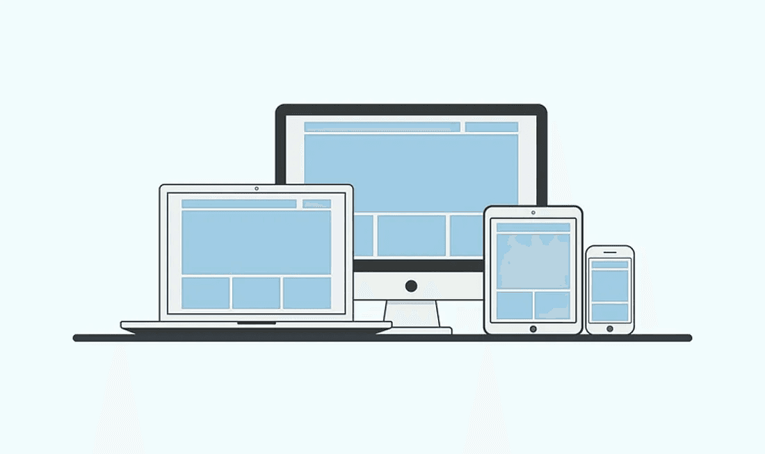
Finally, it’s important to make sure that your website or app is optimized for mobile devices. If it doesn’t work well on smaller screens, users may not bother engaging with it on their phones or tablets.
User Pain Point # 09 : Lack of Human Connection
Oh, and don’t forget about the human touch! If your website or app feels impersonal, users may not feel very connected to your brand.
User Pain Point # 10: Poorly designed error messages
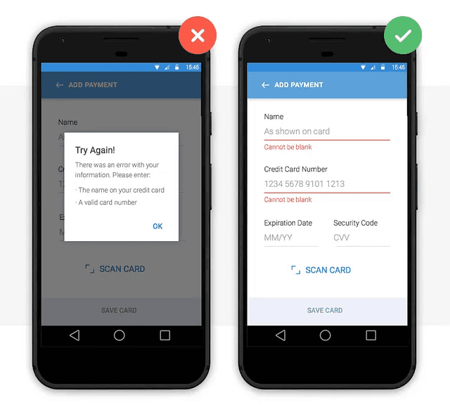
Last but not least, confusing error messages can be a real pain. Clear messages that help users understand what went wrong and how to fix it can make a big difference in the overall user experience.
Ninety-four percent of first impressions to a brand’s website relate to the site’s web design. (Source: Web FX)
III. What are some common misconceptions about User Interface (UI) Design?
There are several myths about this industry that could ultimately result in a poor user experience. These beliefs, which range from thinking that design for one platform alone is sufficient to thinking that aesthetics are the only thing that matter, can have a negative impact on a product’s usability and ultimately its success. I’m here to help you out by dispelling some of the most widespread UI design fallacies and guiding you towards developing a user-centered experience that will delight your audience.
1. “The most crucial element of UI design is aesthetics.”
While aesthetics are unquestionably essential, the goal of UI design is to create a usable interface that is simple for consumers to use. The user may become frustrated if usability is neglected in favour of beauty.
2. “A good UI design is one that never requires any user training.”
While a well-designed user interface should be simple to use and intuitive, it is impractical to expect users to understand a complex interface on their own. Clear tooltips and lessons can be beneficial and help users utilise the software more efficiently.
3. “Users will naturally know how to use a UI that is consistently"

Consistency is crucial, but duplicating the user experience of other well-known apps isn’t a surefire method to design a great interface. It’s crucial to develop apps with consideration for their individual audiences and features.
4. “Minimalism is always better.”
A minimalist design can be beneficial, but it’s crucial to combine minimalism with giving consumers the information they require. In certain cases, expanding the options or content of an app can actually make it simpler to use.
5. “User interface design is a one-time thing.”
User interface (UI) design is an ongoing process that needs to be constantly improved depending on user feedback and developing technologies. For the user experience to be seamless, regular review and upgrades are required.
Data from a survey conducted by PwC revealed that 73% of respondents consider customer experience an important factor in their purchasing decisions, highlighting the importance of good design in customer retention.
IV. What are the elements of UI Design ?
Have you ever interacted with an app or website and felt absolutely lost? Perhaps it was because the user interface (UI) design was poor, making it hard to understand and navigate. The elements of UI design are crucial in creating a seamless user experience.
In this article, I’ll explain the following key elements of UI design with the aim to reduce confusion and increase understanding :
A. Layout and Grids
When it comes to UI design, layout and grids are critical. The layout of a website or app refers to the arrangement of visual elements on the screen, and the grid is the underlying structure that provides an orderly framework to the design. Proper layout and grids help guide the user’s eye and create a natural flow.
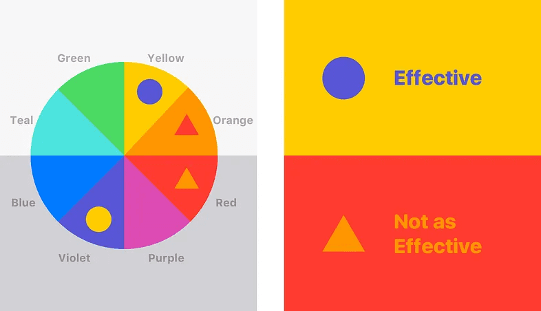
B. Color
Color is an essential aspect of UI design. It plays a pivotal role in evoking emotions, creating meaning, and indicating the importance of specific elements on the page. For instance, a call-to-action button can stand out by using a bright, contrasting tone to highlight its importance.
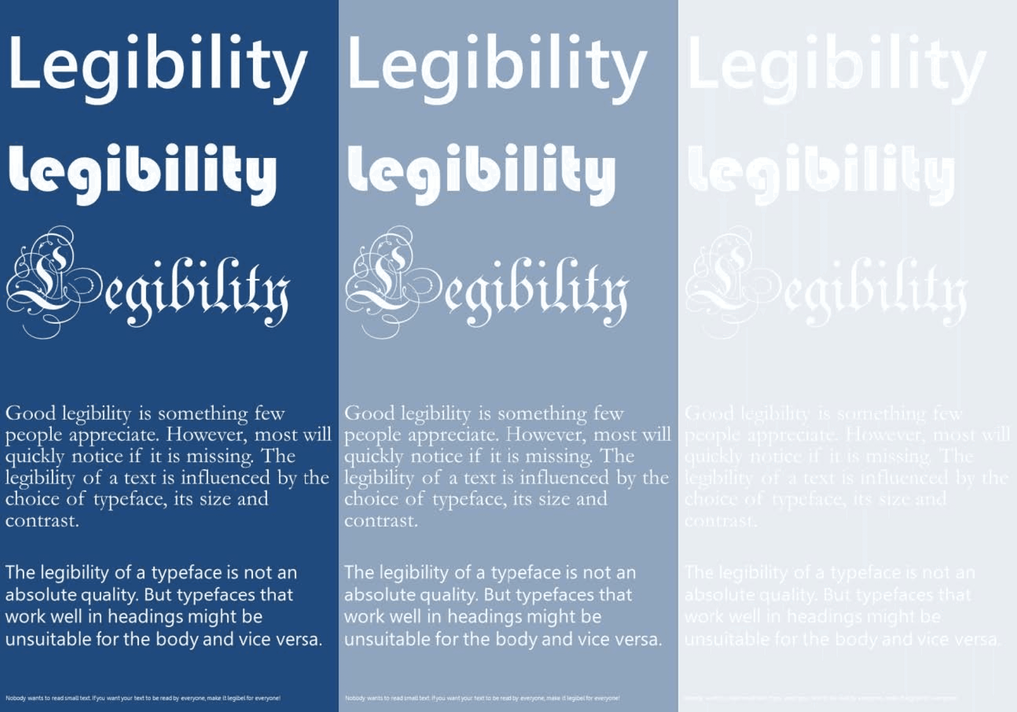
C. Typography
Fonts are more than just pretty letters. They play an important role in UI design. Good typography considers ease of reading, legibility, and creating hierarchy. Proper typeface choice and font size can influence how the user perceives the information.
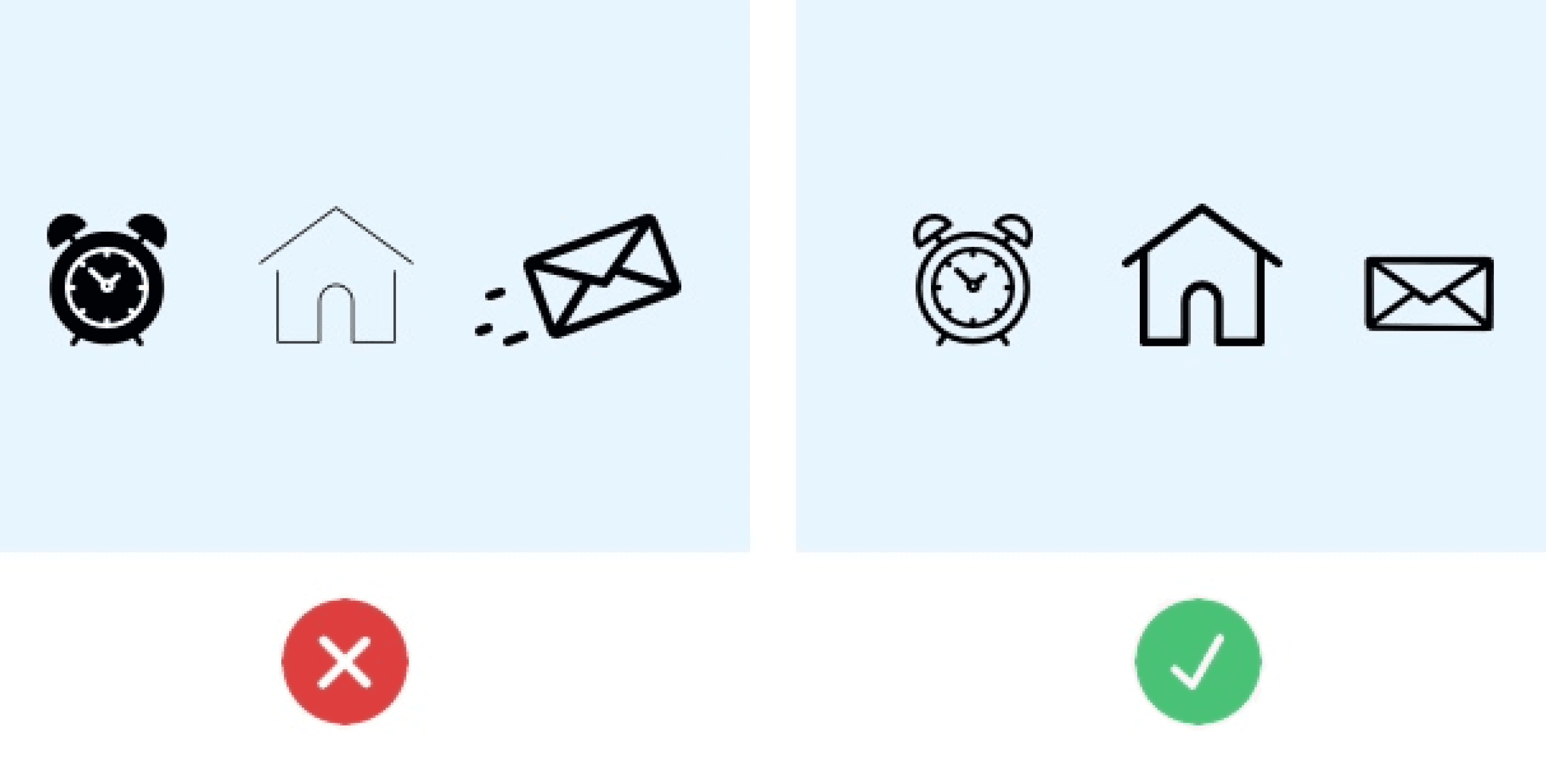
D. Images and Icons
Visual cues are a crucial part of UI design. Including images can create interest and draw the user’s attention. Icons help support quick recognition of important features or functions. Proper use of both can create a seamless user experience.
E. Buttons and CTAs
Got a button on your website or app? Be sure it is well-designed as it provides a hint to users that it is clickable. Call-to-action (CTA) buttons help entice the user to take a specific action, like “Sign Up.”
F. Forms and Input Fields
Have you ever filled out a form and felt completely overwhelmed by the sheer number of fields to input information? Proper form design and input field distinction can save users time and make the process of inputting information more manageable.
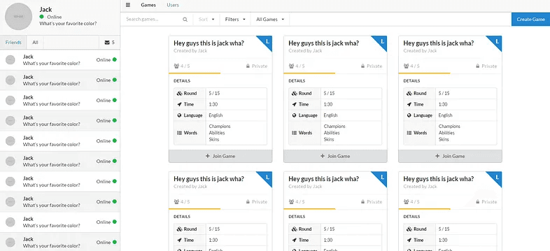
G. Navigation
Navigation is a crucial component of UI design. A well-designed navigation can help users move around with ease, leading to a better user experience. It is important to make the menu bar and navigation options easily identifiable while keeping the user journey in mind.
H. Error Handling and Feedback
Error handling is used when users provide incorrect information. The design should be clear and concise to let users know where they went wrong and how to correct it. Feedback is vital for the user to understand when they have successfully completed a task, assisting them in their journey.
I. User Feedback and Testing
To ensure users have the best experience, designers need to incorporate user feedback and testing throughout the development process. User feedback can help with UI design tweaks and prioritizing new functionality.
J. Accessibility Considerations
UI design for people with disabilities or difficulties accessing the app or website is becoming increasingly essential. Designers need to consider access to devices and software and color contrast, as well as using alt text for images and icons, which presents a more inclusive design for all users.
In conclusion, these elements of UI design are crucial in creating a seamless user experience. Understanding them can help you create better, more visually appealing and intuitive interfaces, resulting in increased engagement and user satisfaction.
Intentional and strategic user experience has the potential to raise conversion rates by as much as 400 percent. (Source: Forrester)
V. What are the key principles of UI Design?
Principals Ui design
Do poorly designed interfaces drive you insane? Learn the 8 key principles of UI Design — Consistency, Clarity, and Simplicity, Visual Hierarchy, Effective Use of Negative Space, Flexibility, Fitts’s Law, Hick’s Law — to create intuitive and user-friendly software that will make your life a breeze!
1. Consistency
Consistency is critical in UI design because it enables users to identify patterns and make predictions about the navigation of the system. Inconsistency creates confusion and frustration for users, leading to longer completion times and a higher chance of them giving up.
2. Clarity
When it comes to UI design, clarity is essential. Users should be able to understand what each element represents at a glance. A lack of clarity leads to confusion and can cause users to feel disoriented and overwhelmed.
3. Simplicity
Users should be able to complete their task with minimal steps. An overly complicated interface can confuse users, leading to longer learning curves and lower user satisfaction.
4. Visual Hierarchy
Visual hierarchy involves arranging and prioritizing interface elements so that users can easily identify critical information. Lack of visual hierarchy makes it difficult for users to identify essential elements and navigate the system efficiently.
5. Effective Use of Negative Space
Leaving adequate negative space helps to clarify and separate interface elements, making them more easily identifiable. Cluttered interfaces are more challenging to navigate and can lead to user frustration.
6. Flexibility
Different users have different needs and preferences. The design should be flexible enough to accommodate various devices, screen sizes, and user needs.
7. Fitts’s Law
It is another crucial principle of UI design that states that the time required to select a target depends on its size and distance from the user’s input device. Designers should take this principle into account when determining the size and placement of interactive elements in the interface.
8. Hick’s Law
It states that the time it takes for users to make a decision increases as the number of choices increases. This principle emphasizes the importance of providing users with a clear and concise decision-making process that minimizes cognitive load.
Website testing is expensive, perhaps the main reason most businesses avoid doing it. Yet, user experience statistics for 2020 show that just five users are enough to find 85 percent of your site’s issues. (Source: Tech Jury)
VI. What are the different types of UI Design?
Different Types of Ui Design
Do you dislike stumbling over convoluted user interfaces that seem to necessitate a computer science degree just to function? You’re not the only one! Thankfully, the design of contemporary user interfaces (UI) has advanced significantly since the days when users could only enter commands onto a computer terminal. UI designs come in a variety of styles nowadays, each with advantages and disadvantages of its own. The most prevalent UI design styles will be examined in this article, from the tried-and-true graphical user interface (GUI) to the cutting-edge augmented reality user interface (ARUI). We’ll now explore the field of UI design while you sit back and unwind.
Graphical User Interface (GUI)
It is the most popular style of UI design, so let’s start there (GUI). In order to facilitate user interaction with a device or software programme, GUI, as the name implies, includes graphical components like buttons, icons, and windows. Compared to the Command Line Interface (CLI), which relies on text-based commands, the GUI has the advantage of being very visual, making it more intuitive and user-friendly. The drawback is that a GUI can become overpowering if there are too many options or if it is crowded with extraneous components.
Command Line Interface (CLI)
It may be the better choice if you’re seeking for a simpler solution. CLI enables users to communicate with hardware or software by entering commands into a terminal or console. The advantage of CLI is that it’s quite effective and strong, especially for seasoned users who favour keyboard shortcuts and scripts to complete jobs. However, CLI has the drawback of requiring more technical expertise and being frightening to newcomers.
Voice User Interface (VUI)
It enables voice commands to be used in conjunction with a device or software application, comes next. For users who prefer to multitask or have physical limitations that make using a keyboard or mouse impossible, VUI’s convenience and hands-free functionality are its main benefits. The disadvantage of VUI, however, is that it necessitates users to speak properly and utilise particular commands, and is not always precise or dependable, especially in noisy surroundings.
Augmented Reality User Interface (ARUI)
It employs the technology to superimpose digital data on the real world. The advantage of ARUI is that it is more immersive and interactive, especially for users who wish to view digital material in a more engaging and realistic way. The drawback of ARUI is that it needs specific technology and software, like augmented reality goggles or mobile apps, which can be expensive or unavailable to some users.
In conclusion, choosing the right type of UI design depends on your needs, preferences, and technical skills. Whether you prefer GUI’s visual appeal, CLI’s efficiency, VUI’s convenience, or ARUI’s innovation, there’s a UI design out there that can make your digital experience more enjoyable and productive. Don’t hesitate to ask us for help if you need further guidance or recommendations!
More than 70 percent of small business websites do not use “call to action” buttons. (Source: Uxeria)
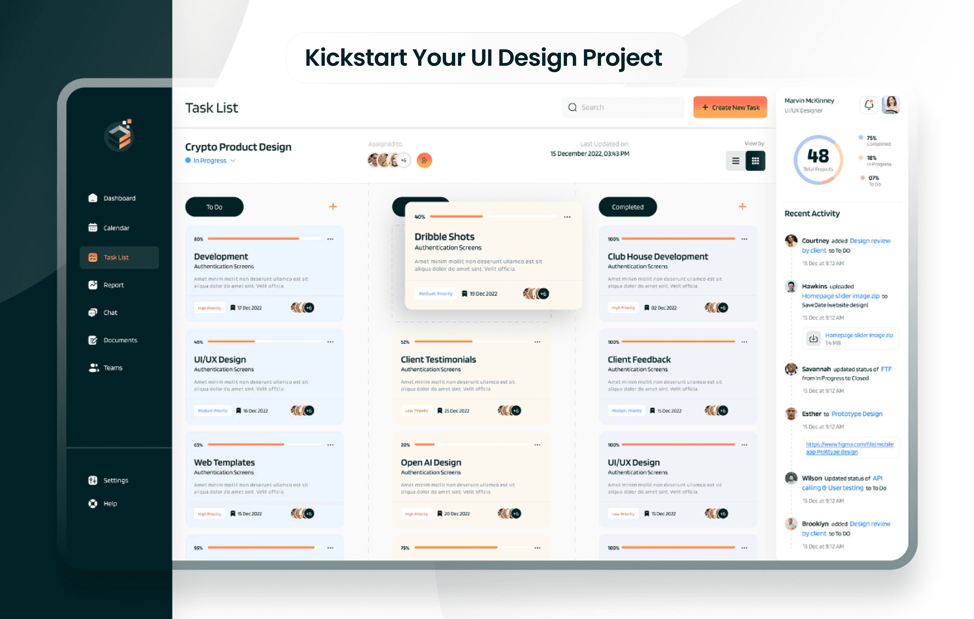
VII. How to Kickstart Your UI Design Project with this 6 Step process ?
Are you tired of navigating through cumbersome interfaces of websites and apps that seem to have little regard for your experience? Maybe you’re frustrated by poorly designed menus, or confused by unorganized content. If so, it’s likely your users share these same pain points. That’s why, as a designer, it’s crucial to consider these user experiences when designing a website or application. In this article, we’ll examine the ideal approach for starting and completing UI design project.
1. Identify User Needs and Objectives
While using an app that doesn’t appear to comprehend your demands, do you ever become frustrated? Have you ever experienced difficulty navigating a website because it doesn’t support your objectives? To create a user interface that resonates with users, it is essential to identify their wants and goals. You’ll be better able to design an interface that suits your consumers’ needs if you take the time to comprehend their problems and their goals.
2. Create an effective Information Architecture
When utilising an app or website, have you ever felt as though you were swimming in a sea of data? If so, you are not by yourself. Finding what you’re looking for might be challenging and frustrating if the information architecture is poor. Because of this, developing a strong information architecture is essential for UI design. Users will be able to discover what they need fast and easily by arranging the information in a logical manner.
3. Iterate and Prototype Your Ideas
Have you ever had the impression that your user interface design is lacking? It’s crucial to keep in mind that designing a user interface is a process, and finding the perfect solution frequently necessitates several iterations. It is crucial to prototype and iterate your concepts for this reason. You can test your idea and collect user input by making a prototype. After that, you can make changes and iterate until you’re happy with the result.
4. Design for Emotions
Have you ever had a deep emotional connection to a website or app? It makes sense that designing for emotions is becoming more and more common in UI design. You may produce a more engaging and memorable user experience by appealing to people’ emotions. Designing for emotions may make your app or website stand out from the competition, whether it’s through colour, imagery, or language.
5. Prioritize usability and accessibility
Have you ever utilised a website or app that was hard to use or inaccessible? Regrettably, this is a reality for many people, particularly those with impairments. Usability and accessibility must therefore be prioritised when it comes to UI design. By making your app or website easy to use and accessible for all users, you’ll create a positive user experience that everyone can enjoy.
6. Follow UI Design Best Practices
Have you ever utilised a website or app that seemed off somehow? It’s crucial to adhere to UI design best practises to make sure your interface appears polished and professional. Following UI design best practises will help your app or website appear its best, from selecting the appropriate typeface to abiding by design concepts like contrast and hierarchy.
75% of online users judge the credibility of a website based on its overall aesthetics (Source: Inside Design Blog)
VIII. What are some common mistakes to avoid in User Interface (UI) Design ?
When it comes to user interface design, first impressions are crucial. It’s crucial to design an interface that is user-friendly, visually beautiful, and functional given the intense competition. However, several frequent UI design errors can be made by even the finest designers, repelling users. We’ll discuss such errors and offer advice on how to avoid them in this article. Let’s start designing now!
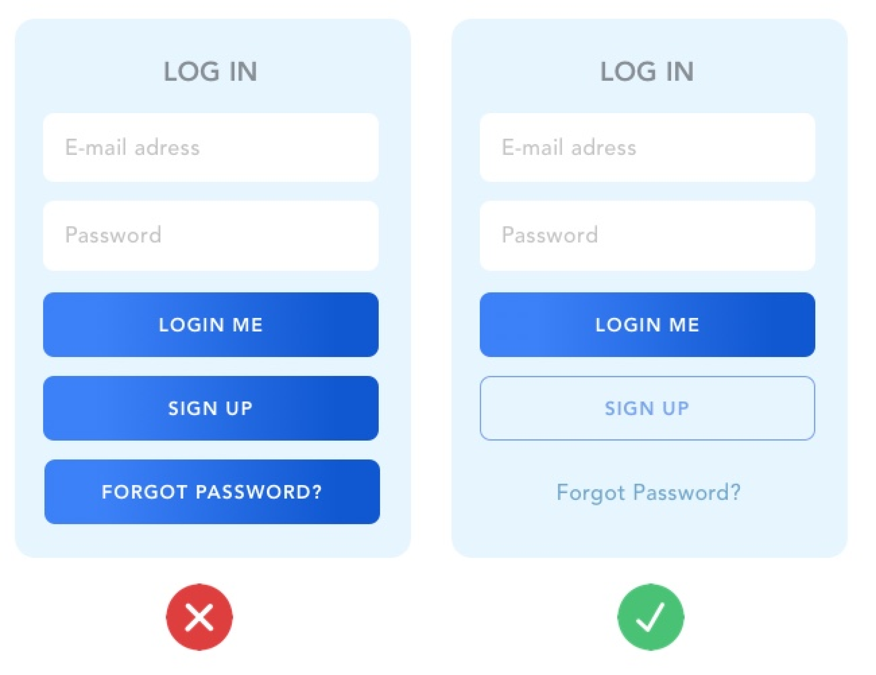
A. Inconsistency
Inconsistency in UI design often results in confusion for the user. Imagine if you click on a button expecting it to perform a certain action, but it does something different on another page. This inconsistency can lead to frustration and make it difficult for the user to navigate your interface. To avoid this mistake, it is important to establish design guidelines and adhere to them throughout the entire user journey.
B. Overcomplication
Overcomplicating UI design is a common mistake that designers make. When there is too much going on, users can become overwhelmed and confused. This results in a poor user experience that users are likely to avoid. To avoid overcomplication, it is important to prioritize the most important elements and features while keeping the interface simple and easy to understand.
C. Poor Usability Accessibility
Poor usability and accessibility can make it difficult for certain users to interact with your interface. This can include users with disabilities or those using assistive technologies. To avoid this mistake, it is important to design with accessibility in mind, including correct font sizes, clear contrast, and alternative text.
D. Neglecting to Conduct User Testing
Neglecting to conduct user testing is a common mistake that can have serious consequences. Without testing and gathering feedback from users, you cannot be sure that your interface is meeting their needs. Conducting user testing throughout the design process can help ensure that your interface is intuitive and user-friendly.
In conclusion, avoiding these common UI design mistakes can help create a positive and intuitive user experience. By focusing on consistency, simplicity, accessibility, and user testing, you can create an interface that meets the needs of all users, regardless of their background or ability.
According to Adobe by 2023, customers will prefer to use speech interfaces to initiate 70% of self-service customer interactions, up from 40% today
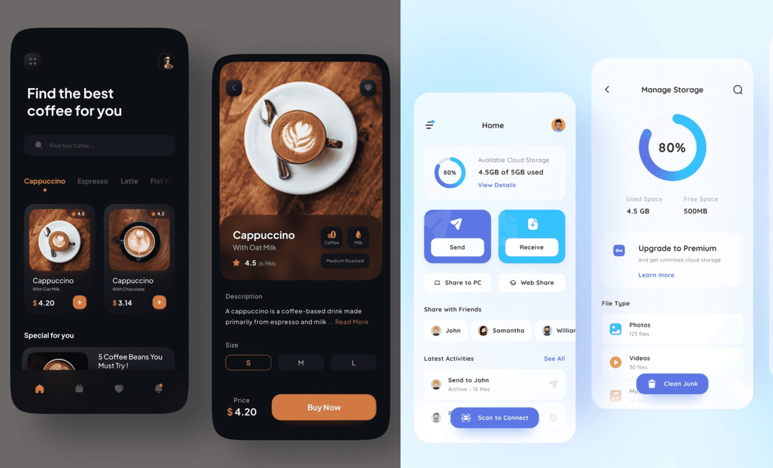
IX. Examples of Excellent User Interface Design
When it comes to user interface design, nothing speaks louder than examples. Real-life examples of excellent UI designs can serve as an inspiration for designers and developers who are looking to create user-friendly and visually stunning products. We’ll take a closer look at some of the best examples across different industries use UI design to engage and retain customers and to give you an idea of what constitutes excellent UI design.
1. Artificial Intelligence (AI): Lobe
Website: https://www.lobe.ai/
Lobe platform allows, anyone may design unique machine learning models without having to write any code.
User interface design style name: Minimalistic UI Design
User Interface Analysis:
Users can construct, train, and test their models graphically using the user interface’s straightforward drag-and-drop functionality.
The user interface also offers suggestions for how to enhance the model’s accuracy and performance.
The user interface makes it easier for users to grasp the promise and power of AI without being overburdened by jargon or technical intricacies.
2. Blockchain: Crypto.com
Website: https://crypto.com/en/index.html
Crypto.com is a platform that enables users to buy, sell, store, earn, and spend cryptocurrencies.
User interface design style name: Dark UI Design
User Interface Analysis:
The user interface is elegant and contemporary with a dark tone that exudes professionalism and security.
To draw attention to crucial details and actions, like prices, charts, incentives, and transactions, the user interface also makes use of vibrant colours and iconography.
Users’ access to and management of their crypto assets and services are made simple and convenient via the user interface.
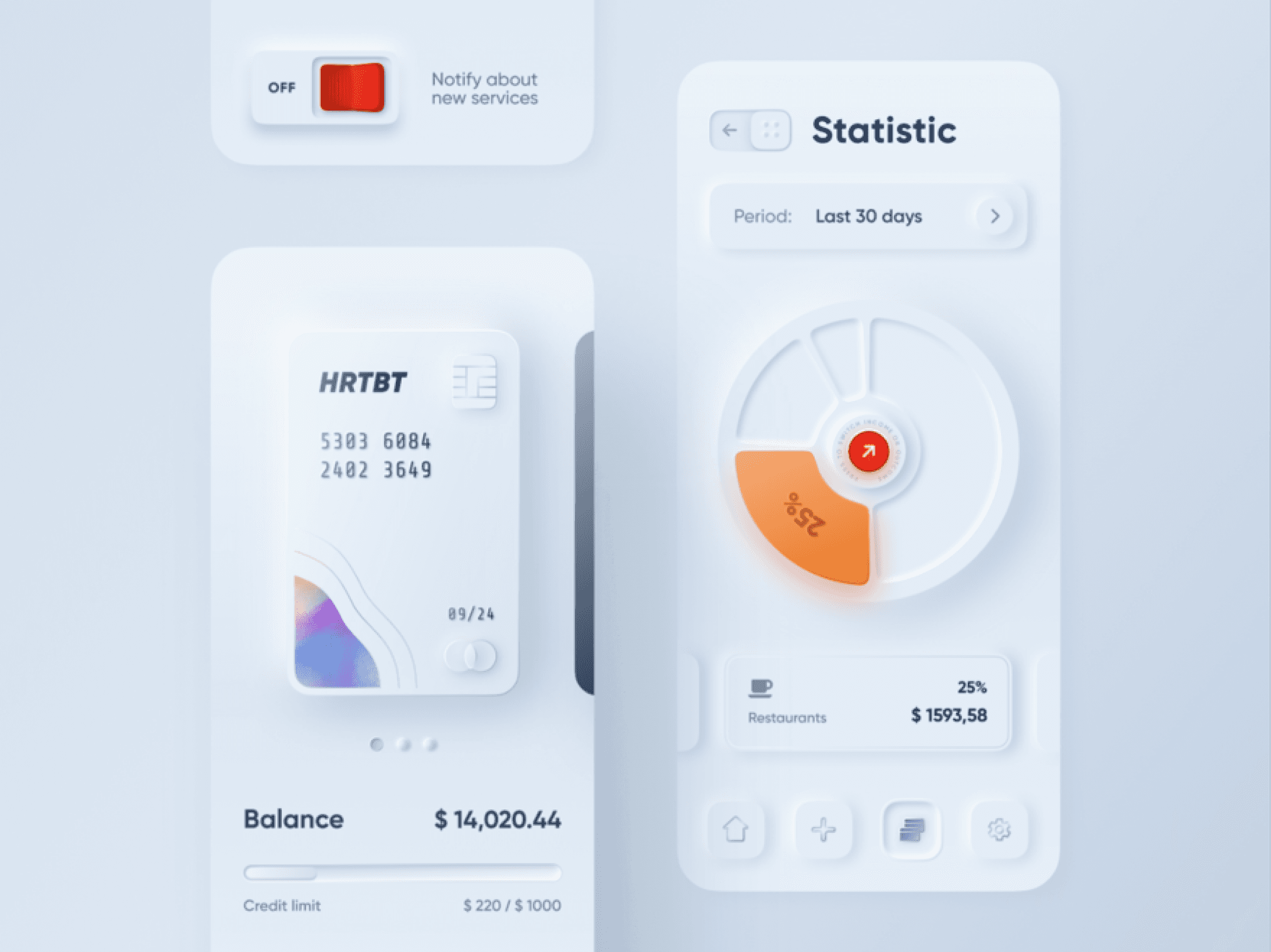
3. Cybersecurity: Dashlane
Website: https://www.dashlane.com/
Dashlane is a password manager and digital wallet that helps users to protect their online identity and privacy.
User interface design style name: Neumorphism UI Design
User Interface Analysis:
The UI is sleek and refined, sporting a neumorphic design that instills a gentle and lifelike appearance.
The UI further boasts nuanced animations and transitions that heighten the user’s involvement and reaction.
With the UI’s help, users can effortlessly establish, safeguard, and automatically insert their passwords and personal data in a delightful manner.
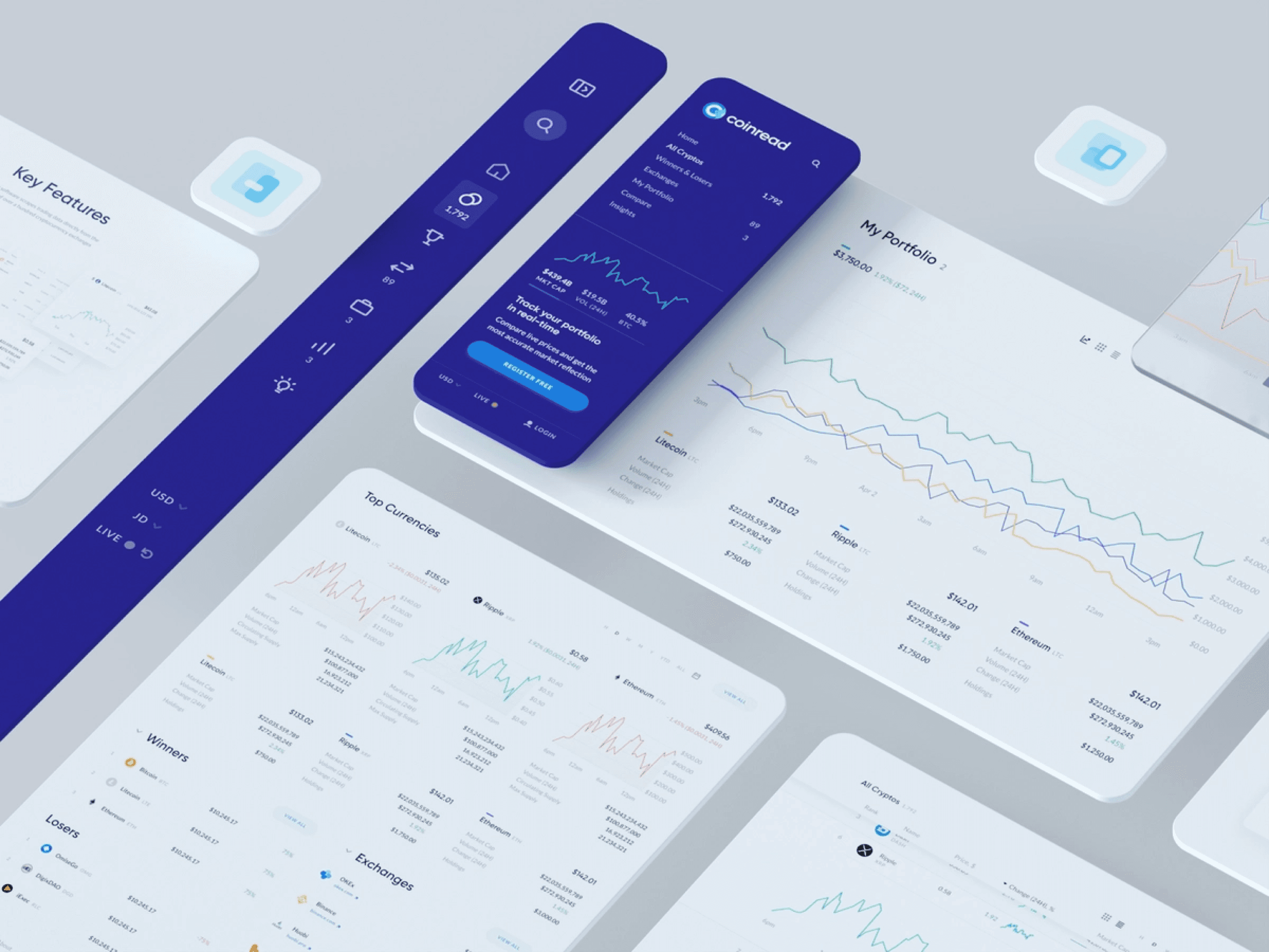
4. FinTech: Revolut
Website: https://www.revolut.com/
Revolut is a financial super app that offers banking, investing, trading, budgeting, and more services.
User interface design style name: Flat UI Design
User Interface Analysis:
The flat style of the user interface, which lessens visual clutter and enhances readability, makes it simple and practical.
The user interface also makes use of vibrant colours and graphs to present facts and information about, for example, spending patterns, financial objectives, and market trends.
Users may access different financial products and manage their finances with ease thanks to the user interface.
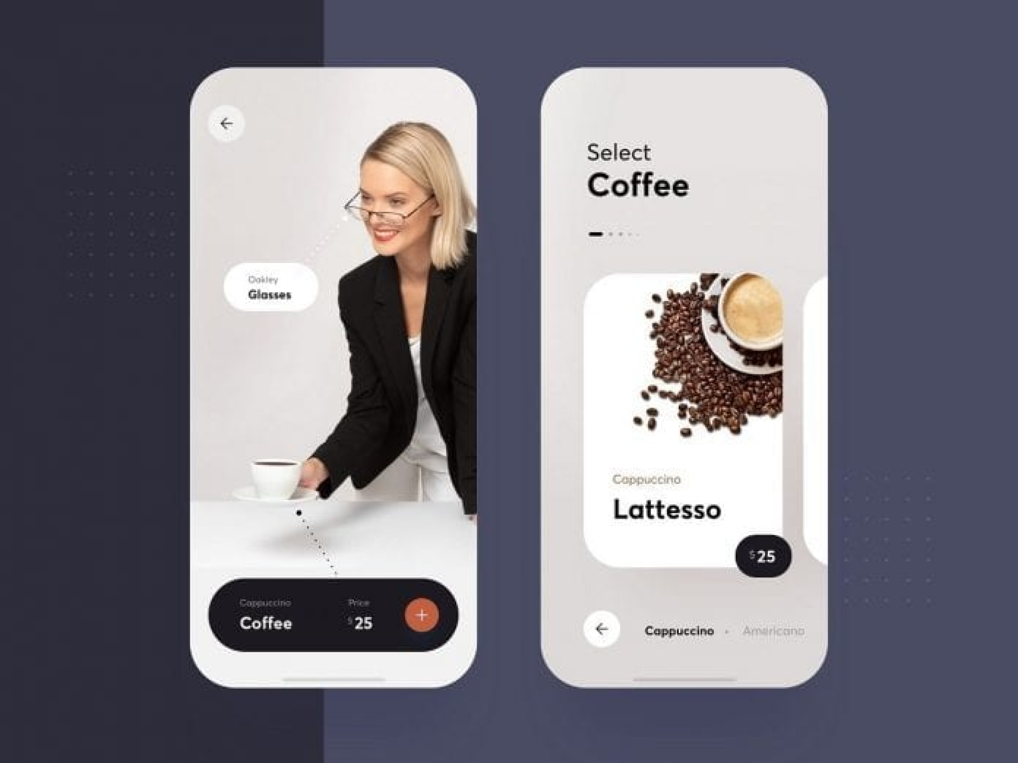
5. Healthcare: K Health
Website: https://www.khealth.ai/
K Health is a platform that provides personalized health information and telemedicine services.
User interface design style name: Illustrative
Unique points:
The user interface is warm and inviting, with expressive design that adds personality and charm.
In order to communicate with users and comprehend their symptoms, problems, and demands, the user interface also employs conversational UI and natural language processing.
Users can easily and comfortably access high-quality care and receive accurate health information thanks to the user interface.
6. E-commerce: Allbirds
Website: https://www.allbirds.com/
User interface design style name: Minimalistic UI Design
User Interface Analysis:
The website uses a straightforward design with lots of white space and little text to highlight its products and core beliefs.
To provide a seamless and interesting user experience, the website incorporates subtle animations and transitions.
Users can simply locate what they’re looking for on the website thanks to its simple and consistent navigation system, which includes clear icons and labels.
7. EdTech: Duolingo
App: https://apps.apple.com/us/app/duolingo-language-lessons/id570060128
Funding status: IPO
User interface design style name: Gamified UI Design
User Interface Analysis:
To make learning languages enjoyable and inspiring, the app has a bright, entertaining design with adorable characters and animations.
To motivate users to consistently practise and advance in their skills, the app includes a gamified system with levels, badges, streaks, leaderboards, and incentives.
The app uses a personalised and adaptive learning strategy with bite-sized lectures, quizzes, tales, podcasts, and live events to fit various learning styles and objectives.
8. CleanTech: Arcadia
Website: https://www.arcadia.com/
User interface design style name: Illustrative UI Design
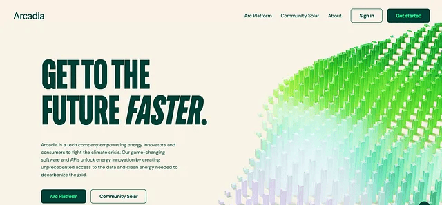
User Interface Analysis:
The website uses a bright and cheerful design with illustrations and icons to convey their mission of making clean energy accessible and affordable for everyone.
The website uses a clear and concise copy with headings, bullet points, and testimonials to explain how their service works and what benefits it offers to users.
The website uses a simple and easy sign-up process with a few steps and inputs to help users connect their utility account and choose their preferred plan.
9. FoodTech: Too Good To Go
App: https://apps.apple.com/us/app/too-good-to-go-fight-food-waste/id1060683933
User interface design style name: Flat UI Design
User Interface Analysis:
The app has a contemporary and eye-catching appearance thanks to its flat design, vibrant colours, and iconography.
Users may find nearby restaurants and grocery stores that provide surplus food at discounted pricing using the app’s map-based interface, which also includes filters and categories.
With the help of the app’s social impact feature, users can see how much food they’ve saved, how much CO2 they’ve avoided, and how they compare to other users in their neighbourhood.
10. Social media: Clubhouse
App: https://apps.apple.com/us/app/clubhouse-drop-in-audio-chat/id1503133294
User interface design style name: Dark UI Design
User Interface Analysis:
The app has a sophisticated appearance because to its dark user interface (UI), contrasted hues, and gradients.
The app displays several rooms and clubs that users may join or create for live audio chats using a card-based interface with visuals and text.
The app employs tabs, buttons, menus, and gestures as part of an easy-to-use navigation system to let users connect, explore, and engage with other users.
11. Travel and Hospitality: Airbnb
Website: https://www.airbnb.com/
User interface design style name: Responsive UI Design
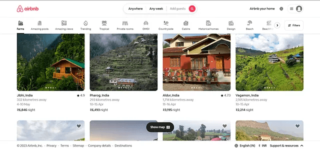
User Interface Analysis:
For a consistent and superior user experience, the website has a responsive design that changes to fit multiple screen sizes and devices.
The website showcases a variety of lodging options, activities, vacation destinations, and guides that customers can browse or book using a grid-based structure with images and text.
Users can filter results using the website’s smart search function according to location, date, price, amenities, type of accommodation, cancellation policy, etc.
12. On demand service : Dribble
Website link is https://dribbble.com/.
Dribbble is a platform where designers can showcase their work, find inspiration, and connect with clients.
User interface design style is *minimalistic** and **colorful**, using cards to display different projects and categories.
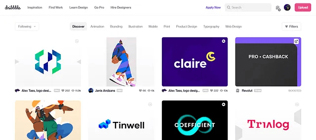
User Interface Analysis:
The users may browse, search, post, and access their profile and preferences with ease because to the navigation bar’s simplicity and intuitiveness.
The website is responsive and accessible because to its usage of a grid layout that changes to fit different screen sizes and devices.
To draw attention and highlight the diversity and creativity of their community, they utilise eye-catching colours and pictures.
13. Internet of Things (IOT) : Cognito
Website link is https://cognito.ai/.
Cognito is a platform that enables businesses to create smart applications using IoT data.
User interface design style is **modern** and **sleek**, using custom animations and icons to illustrate their features and benefits.
User Interface Analysis:
They use a dynamic and interactive landing page that showcases their value proposition and invites users to explore more.
They use a clear and consistent visual hierarchy that guides users through the information and actions they need to take.
They use subtle animations and transitions to create a smooth and engaging user experience.
14. Gaming : Rally
Rally is a platform that allows gamers to create and join communities around their favorite games.
Website link is https://rally.io/.
User interface design style is **gamified** and **fun**, using bright colors, illustrations, and badges to motivate and reward users.
User Interface Analysis:
The platform has a gamified onboarding procedure that gives consumers an interactive introduction to the capabilities and advantages of the site.
The platform uses a dashboard to presents the user’s achievements, communities, activities, and profile in an orderly and appealing manner.
They make use of a chat function that lets users interact with other players and participate in live events.
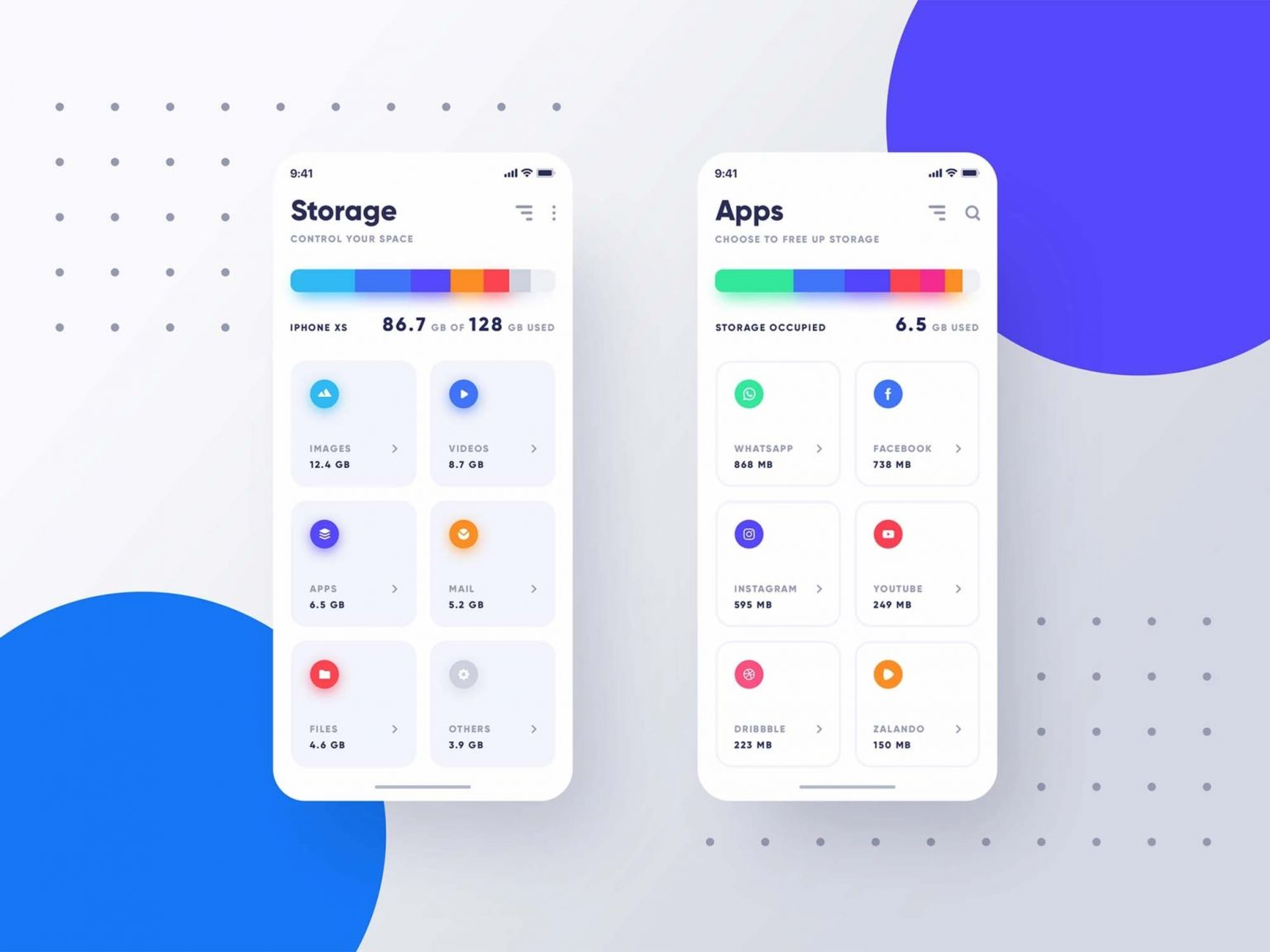
15. Mobile Apps : Current
Website link is https://current.com/.
Current is a mobile banking app that helps users manage their money more easily.
User interface design style is **clean** and **minimalistic**, using dark UI elements and gradients to create contrast and focus.
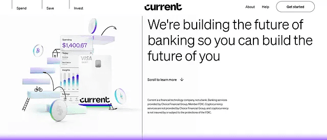
User Interface Analysis:
Users may access their accounts, transactions, cards, savings, and settings via a clear and straightforward navigation bar.
They display the user’s spending patterns, income, and balance in an understandable manner using charts and graphs.
To assist users save money, get rewards, and avoid costs, they employ notifications and advice.
16. Virtual Reality (VR) and Augmented Reality (AR) : Hello Monday
Website link is https://hellomonday.com/.
Hello Monday is a creative studio that creates immersive experiences using VR/AR technology.
User interface design style is **innovative** and **experimental**, using 3D models, animations, and sounds to create immersive environments.
User Interface Analysis:
In order to produce accurate simulations of many circumstances, including travelling, learning, and working, they use VR/AR technology.
Users can engage with the VR/AR world naturally thanks to the usage of gesture-based controllers and vocal commands.
They employ feedback systems to increase the user’s experience of presence, including haptic vibrations, noises, and visual cues.
17. Robotics: Energy Robotics
Website: https://energy-robotics.com/
UI design style: Minimalistic
User Interface Analysis:
Clean and simple layout with clear navigation and icons
Use of blue and white colors to create contrast and highlight important information
Use of charts, graphs, and maps to visualize data and status of robots
Use of video streaming and remote control features to enable real-time interaction with robots
18. Cloud Computing: DigitalOcean
Website: https://www.digitalocean.com/
UI design style: Flat design
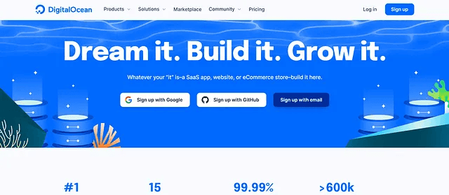
User Interface Analysis:
Use of bright and vibrant colors to create a friendly and inviting atmosphere
Use of illustrations and animations to explain complex concepts and services
Use of cards, buttons, and tabs to organize information and actions
Use of feedback and progress indicators to show user activity and performance
19. 3D Printing: Shapeways
Website: https://www.shapeways.com/
UI design style: Material design
User Interface Analysis:
Layouts that are open and balanced are made using a grid system and white space.
Using pictures and videos to display items and designs
Filters, categories, and a search engine are used to assist consumers discover what they need.
Using tooltips, modals, and sliders to provide extra options and information
20. Space Technology: Rocket Lab
Website: https://www.rocketlabusa.com/
UI design style: Dark UI
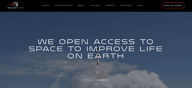
User Interface Analysis:
Using neon colours and a dark background to give off a futuristic vibe.
To make a dynamic and captivating experience, use transitions and parallax scrolling.
Use of icons, labels, and badges to draw attention to important qualities and accomplishments
Use of live streaming, social media feeds, and countdowns to alert users on debuts
Excellent UI design examples are those that combine simplicity, functionality, and usability to provide users with an exceptional user experience. By studying real-life examples of excellent UI design, designers and developers can gain inspiration and learn valuable lessons about how to create products that meet the needs of users.
ESPN.com revenues jumped 35 percent after they listened to their community and incorporated suggestions into their homepage redesign. (Source: Inside Design Blog)
In conclusion, creating a user-friendly, visually appealing user interface design has become a priority for businesses looking to make a splash in the digital marketplace. With The Ultimate User Interface Handbook as your guide, you can empower your design and create a memorable online experience for your customers. Don’t just settle for a run-of-the-mill website or digital product — stand out from the crowd with a design that users will love.
Also, make sure to hit the like and subscribe button to stay tuned for more valuable insights on brand identity design, user interface design, website development, content strategy, and digital marketing. Our series of comprehensive articles are guaranteed to give you the tools and strategies you need to take your online presence to the next level.


